Typo Bilder Buch

Part I.

            Typo Bilder Buch (Typo Picture Book) (2012), by Romano Hänni, is an artist’s book made of cardboard and paper towels. Hänni letterpress printed 65 copies of the book. He used the colors red, yellow, blue, and black. There is some readable text, printed in German, but most of the book is made up of illustrations made out of typography. Hänni uses both serif and sans-serif typeface, along with some of his own printing forms, to create some obscure shapes and some recognizable images. These typographic scenes were printed onto sheets of paper towel, which were then stitched together and bound in a cardboard cover with a paper dust jacket. It comes with a four-page English translation of the German text.

Hänni’s Website also offers the following description of the work:

The page layout was deliberately not prepared. The design and sequence of the pages were intended to develop during the work process. The first printing forms were blue lines and linear frameworks at the bottom of the pages. New ideas developed during the unrolling and tearing off of double pages of paper towel as well as during composition, setup, printing and removing of the type.

The printing workshop represents the available raw materials: Lead characters, synthetics and wood, brass lines and signs, typographic signs and lead symbols. The typo pictures were composed from individual parts and printed on the hand proofing press; some of them were superimposed in several printing cycles. They are intended to mutually influence and merge into each other and to display an inner connection.

The page format was determined by the paper: Paper towels, maxi roll; composition: 100% oxygen-bleached pulp (54 g/m2± 5%), wet strength additives, agents; roll length: 62,1 m ± 2%, sheet size: 23×26 cm, ± 2%, paper from responsible sources.

Part II under the cut:

Continue reading

The Importance of Portability in the Ethiopian Magic Scrolls

Part 1: The Bibliography

Ethiopian magic scrolls are long, narrow composite objects made from multiple parchment strips joined end-to-end. Each strip is thick, stiffened, and bears a natural light-brown tone on the flesh side and a slightly darker underside. The strips are sewn together with leather through pairing holes or simple overcast stitching, producing a continuous scroll that can measure several feet in total length while remaining narrow in width, as small as a few inches. When rolled, the scroll curves with the inscribed surface facing inward, protecting the written and pictorial elements.

The support is vellum, prepared to a fairly coarse finish. The parchment’s rigidity increases with age; edges may cockle and some strips show folding creases where the scroll was repeatedly rolled. The flesh side retains more abrasion and darkening than the hair side, and occasional thinning or worming may be present at stitch sites. Surface abrasion and small losses are visible along fold lines and at the stitched joins, but overall the sheets remain structurally sound because of the substantial thickness of each strip.

Rather than a codex binding, the scroll is an assembled roll: individual parchment leaves are joined by sewing and sometimes reinforced with narrow leather or cloth patches at the joins. The leather ties that hold the seams together are visible along the reverse. There is no spine in the codicological sense; instead the object’s cohesion depends on the stitching sequence and the outer tie or wrap used to close it when not in use. The scroll may have had a primary outer fastening—cord, leather strap, or a protective cover—but in many preserved specimens this has been lost or survives only as fragments.

The text is written vertically along the length of the scroll and is usually arranged in either single narrow columns or paired columns read left to right along the unrolled surface. Columns are separated from pictorial fields and marginal notation by decorative ruling. Narrow vertical guide lines or ruled margins run near the outer edges of the strips and help constrain the writing. Lines of text are regularly spaced; scribal hand size varies but is generally compact to economize the limited width of the support.

The script is Ge’ez, written by hand in a black ink that remains the primary graphic element across the scroll. A secondary pigment of various colors, although the accent color is typically the same on each scroll, is used sparingly to highlight words, headings, invocations, or to add details to drawn figures. The ink thickness and stroke quality indicate that the writing style is consistent with no added emphasis such as larger text or bold for headings. It also implies that each scroll is written by a single person. Occasional corrections and overwrites show that the scribe worked directly on the parchment without extensive preparatory sketches.

The horizontal separators between text and images are decorative bands featuring geometric shapes and repeated motifs—zigzags, triangles, and dot or chevron patterns—executed in black and sometimes accented with color. These bands serve a dual purpose: organizing the scroll’s sections and visually distinguishing textual matter from pictorial. Vertical ruling lines, often drawn in faint ink, mark margins and provide alignment for columns. Illustrations are hand-drawn and integrated into the scroll at specific locations rather than being appended as loose plates. Figures typically occupy a full-width zone between bands of text and are often framed by the decorative horizontal lines. The imagery tends to be schematic and symbolic: supernatural human-like creatures, saints or holy figures, crosses, and anthropomorphic protective talismans. Figures are drawn primarily in black ink with selective colorful accents for haloes, garments, or weapon details. Compositionally, the head and torso are frequently emphasized and stylized while limbs and lower bodies are reduced or abstracted to fit the narrow format. Marginalia and small talismanic markings may appear beside the main figures. Small marginalia, cryptic signs, and talismanic diagrams often inhabit the spaces between text columns and pictorial panels. 

Width is consistently narrow compared with the overall length, designed for portability and sequential unrolling. The scroll’s edges may show darker handling wear, and the outermost sections—those rolled on the outside—are more abraded and discolored. Creasing and flattening along repeated fold or roll lines show frequent use. The reverse side occasionally contains practice strokes or inventories of ingredients, suggesting the scroll served as a working tool for a practitioner rather than as a display object. The entirety of the page is utilized. The scroll alternates blocks of text with pictorial vignettes, separated by decorative horizontal rules. This alternation suggests a ritual sequence where textual incantations, lists of names, or liturgical formulas accompany visual protective figures. The scroll lacks foliation in a modern sense; navigation would have been tactile and visual, using repetitious graphic markers to find specific spells or images.

Ownership marks on these scrolls are often non-standard: small inscriptions naming an owner or healer, added seals, or pasted strips with later annotations. Repairs are common at sewing joins and along edges; some repairs use later leather or cloth strips and modern threads. Repaired holes and patching indicate the scroll’s continuous practical use and value.

As a material object, the Ethiopian magic scroll sits at the intersection of manuscript, talisman, and ritual implement. Its narrow, stitched construction, combined inks and pictorial elements, and clear signs of handling identify it as a portable healing or protective tool assembled and maintained by a practitioner—often a church-associated or lay exorcist—rather than a book intended for passive reading in a library. Its physical wear, repairs, and layered marginalia document a continuous, practical life in the hands of practitioners and owners rather than an archival, library-centered existence.

Part 2: The Analysis

Ethiopian magic scrolls are religious objects designed to move: long, narrow rolls of sewn parchment whose images, texts, and physical form function together as portable technologies for purging illness and restoring a person’s capacity to circulate in daily life. They are tailored to the individual wearer, alternately banded with blocks of Ge’ez text and pictorial plates that are exposed sequentially during rites designed to expel evil spirits and demons. Reading the scroll through mobility—how it is carried, worn, unrolled, repaired, and exchanged—reveals how form follows function: portability shapes pictorial composition and ritual use, while the scroll’s preservation attests to its therapeutic value.

The scroll’s construction emphasizes durability and compactness. Multiple thick parchment strips are sewn end-to-end and often reinforced with leather stitching and outer ties so the roll can be tightly wound for transport and repeatedly unrolled for ritual display. The narrow width minimizes bulk and weight while a long linear sequence provides staged content: the healer unrolls to the next pictorial plate, exposes it to the patient or congregation, performs the corresponding invocation, then rerolls the scroll for transport. Unlike a codex, whose spine and sewn gatherings favor stationary consultation and page-turning, the scroll’s rolled format is optimized for motion—carrying in a case, slipping under a cloak, or wearing on and around the body—so that sacred images and texts travel with both practitioner and client.

Many healing scrolls are bespoke objects made to a client’s height so the unrolled sequence corresponds to body zones from head to foot; the client’s name is often added to confirm the scroll’s directed purpose. This personalization allows the scroll to be wrapped around a person for head-to-toe protection, converting the object into a wearable talisman rather than a passive book. Image placement therefore follows a bodily logic: plates addressing head ailments appear near the beginning of the unrolled length, chest or abdominal protections appear mid-scroll, and so on. The entirety of the scroll is custom made for the client. They weren’t mass produced for sales or profit, and they weren’t completely standardized. 

The pictorial program is central to the scroll’s portable functionality. Images are schematic and bold—emphasizing heads, eyes, haloes, weapons, nets, and geometric talismans—so they read quickly during ritual exposure. Large, high-contrast outlines in black ink provide immediate legibility; selective accenting in red, pink, blue, or brown highlights operative features and acts like a visual rubric for the practitioner. Decorative horizontal bands frame pictorial plates and act as visual separators, enabling quick navigation: a healer can feel or see the next band, unroll to the next plate, and enact the corresponding rite without laborious textual search. The imagery therefore functions as both symbol and instruction: it signals which spiritual agent to invoke, which body part to treat, and which physical gesture or handling the healer must perform to activate the talismanic power.

These scrolls are explicitly religious instruments whose primary therapeutic mechanism is spiritual: they eliminate illness by expelling demons and evil spirits through a ritual sequence of images and prayers. The pictorial plates often combine Christian iconography—crosses, haloed figures, archangels—and apotropaic geometries; this combination anchors the scroll’s authority in recognizable sacred figures while deploying talismanic signs that trap or bind harmful forces. The healer’s use of the image—exposure, touch, motion over the afflicted body, and recited Ge’ez formulas—constitutes a ritual technology that enacts exorcism and thereby seeks to restore bodily and social mobility. The scroll’s portability is thus integral to its religious aim: to move to the afflicted, to act on their mobility, and to return them to the social circuits of work, worship, and family life once cured.

Wear patterns and repairs document that the scrolls were frequently touched and wrapped in different positions. Outer rolls often show darkened edges and abrasion consistent with exposure to hands, dust, and sweat; localized creasing at frequent fold points indicates repeated unrolling in varied settings. Repairs—re-stitched joints, leather or cloth patches, and later thread types—reveal conscious decisions to maintain a working object rather than retire it. Marginal additions and smaller later hands that write extra talismans or ownership notes mark episodes when the scroll passed between owners or was adapted for new clients. These material interventions form a palimpsest of movement: every patch, re-sewn seam, and added mark is evidence of the scroll’s circulation through households, marketplaces, and the fact that they were repaired means that the owner wanted them to last.

Mobility is not only physical but also social and economic. Portable scrolls enter markets of exchange as commissioned goods, gifts, or loaned items; their production and repair involve craft resources and payments, creating material ties among clients, healers, and suppliers. A bespoke scroll is a costly, tradable asset: commissioning one signals social investment in a person’s health and mobility, while repairing and reusing a scroll demonstrates communal trust in its efficacy. Ownership inscriptions, pasted strips, and added seals or marginal notes trace the social routes of exchange and binding relationships across families and communities. Following the scroll as it moves reconstructs networks of care and the flows of protective knowledge otherwise invisible in institutional archives.

The scroll’s ultimate purpose is to restore the patient’s independent capacity to circulate. In agrarian and market-based societies where mobility links directly to livelihood and social participation, a ritual technology that physically travels to the patient and acts to remove spiritual impediments to movement is especially salient. Wearing a scroll made and named for you is a literal aid to reentering everyday movement: it protects while traveling, it signals healed status to others, and it materially documents a therapeutic intervention. Thus portability mediates the relationship between health and social being, enabling individuals to reclaim the spatial freedom necessary for economic, religious, and familial life.

Viewed through mobility, Ethiopian magic scrolls appear as engineered objects whose sewn structure, bespoke sizing, bold imagery, and patterns of repair make them effective devices for itinerant spiritual care. The differences from codex books—rolled format optimized for handling and wearing, image sequencing aligned to bodily use, and tactile navigation suited for fieldwork—underscore how form is adapted to social function. Future study pairing close material analysis (wear-pattern mapping, thread and pigment assays) with ethnographic accounts of contemporary practice would deepen understanding of how mobility signatures vary across regions and communities. Tracking scrolls as moving things recasts them not as static artifacts but as active participants in networks of healing, exchange, and movement that sustained religious life in Ethiopia for centuries.

Works Cited

Windmuller-Luna, K. (2015, April 1). Ethiopian healing scrolls. The Metropolitan Museum of Art. https://www.metmuseum.org/essays/ethiopian-healing-scrolls 

More Than Just a Book: An Exploration of the Implications of the “Spanish Dominican Choral Book”

Bibliography

Finished in 1726, the Spanish Dominican Choral Book boasts a size of 18 inches tall, 12 inches wide, 2 inches in height. The book is protected by a cover made of wooden boards bound in leather that appears a bit weathered and frayed on the bottom of the spine and inner corners, but is otherwise intact. Both the front cover and back cover feature metal inlays with barnacle or flower motifs, rounded studs lining the edge, decorative metal corners, and two rectangular metal clasps. The spine features four raised bands, indicating the book was sewn together. Filling the space between the book’s spine and book block are plain endbands, which aid in the preservation of this choral book. 

The untitled antiphonary contains hymns and chants written in both Latin and Spanish in red and black lettering. Pages are numbered incorrectly, with leaf 29 numbered as 28; leaf [31] unnumbered; leaf 30 numbered as 29; leaves 32-34 numbered as 30-32. The majority of pages within the book are made of parchment and inscribed by hand using ink. The pages’ edges are painted red, which has bled onto the borders of the pages inside. The book’s hymns include illuminated lettering, often in red, preceding the verses and accompanying five line-staves written with red ink. The musical notation, written in black, uses neumes to denote the pitch at which the syllables are sung, but not the rhythm. After page 99,  a table of contents names the hymns’ titles. After the table of contents are additional hymns with unnumbered pages, written in a different and more elaborate font.

Page 3 of Spanish Choral Book

The Spanish Dominican Choral Book also has a colophon that, when translated from Spanish to English, reads “This book was sent to me to be made for Doña Ifabel and Sor Juan who were singers at the Dominican Religious Consolation Convent of La Rambla in 1726. Written by Fr. Ludovicus Ayllon of the same order,” revealing that the book was made in Spain, though most of the text is in Latin. In a page before the previously mentioned colophon, another one written in red ink and inside an inverted triangle reads, “The tone written for our father serves any purpose in the order. The tone of Saint Austin’s Lucius serves any purpose. The tone of all this is given to the feast of all the fields of the order,” which describes how the hymns in the Choral Book would’ve been meant for various occasions. 

The colophon, which names the convent the book was for and the scribe who wrote it.

Analysis

When imagining a book from the eighteenth century, one might picture a decrepit artifact showing its centuries of age in yellowed, decaying pages, elaborate, illegible text, and archaic language. Yet, that is not exactly the case for the 1726 Spanish Dominican Choral Book. Instead of a dying book, the Choral Book remains in relatively good shape with legible words. Though there is some damage to the inner corners of the book, warped pages, and some separation between book blocks and the spine, the Spanish Dominican Choral Book has withstood the test of time and lives in Special Collections to tell its tale. This leads to questions of how a book of such age can be preserved so well, with answers lying in its construction. The Spanish Dominican Choral Book, with its cover of ornate metal inlays, clasps, and use of neumes, not only flaunts the Catholic Church’s wealth but also how books served as an exercise in restricting knowledge and as a testament to the Church’s withholding of  knowlede by enforcing oral tradition.

The Spanish Dominican Choral Book is bound in wooden boards, wrapped in brown leather, and embellished with charming metal inlays, all of which aid in the preservation of this sacred text, while also displaying the immense wealth of the Church. When crafting a book, everything is intentional and costs money: from the material of the cover and pages to the font chosen. Being a sacred text meant that the Choral Book had to be made of top-quality material, aesthetically pleasing, and constructed to last a long stretch of time, which it has accomplished thanks to these elements being funded and put into practice. The wooden boards of the Choral Book are still intact,  providing a sturdy structure, while the leather casing protects the wood boards and book blocks from daily wear and tear. The metal inlays of the book are not only beautiful in their possibly oceanic or floral motifs, but also serve to protect the book. These metal inlays raise the book about an inch off any flat surface when lying down and keep the book the same length away from other books when filed onto a shelf. Having this raised surface can help in preserving the book, as it prevents the immediate surface of the book from interacting with grime or a wet surface and doesn’t allow friction between the leather cover of the book and any surface to occur. The corners of the book are also embellished with metal, which secures the leather on the wood boards and prevents the corners from getting severely damaged and fraying. Though these metal inlays were both beautiful and practical, they were also presumably expensive since metal was a more scarce resource that required lots of fuel to manipulate it. Though the Church could’ve made the book without these embellishments or high-quality materials, they didn’t and spared little cost. Lastly, on the outside of the book are rectangular metal clasps that secure the book shut. This prevents the pages of the book from being exposed, which consequently aids in the preservation of the book and its text. Though one might pick up the Choral Book just to awe at the Latin hymns that were handwritten, despite Gutenberg’s press being a popular mode of book creation as early as the 15th century, that wasn’t the only thing created by hand. Everything was crafted by hand, which meant everything had to be purchased, then given to craftsmen to transform and apply to the book, an expensive and laborious endeavor. Some monks would sit for many hours to painstakingly write out the hymn’s lyrics and notation, while others would proofread and correct mistakes, some were tasked with illuminating the script, and others had the job of putting the book physically together and binding it, all of which cost a hefty amount in supplies and providing for the monks. Being able to fund such an endeavor required plenty of money and the luxury of time, which the Church was able to provide in order to advance its mission of spreading Catholicism.  

Though some of the aforementioned physical aspects of the book may seem arbitrary, the inclusion of the metal clasps and use of neumes for musical notation symbolize the restriction of knowledge through the use of oral tradition. In Spain, “until 1782, the inquisitorial prohibitions of 1551 and 1559 against the printing, selling, or possession of a vernacular version, either complete or partial, of Holy Scripture remained in effect” (Frago, 581). This meant that common people of Spain, who could’ve had the ability to read in their vernacular, couldn’t access one of the most printed books, the Bible, in their tongue. Instead, primarily religious authorities were the ones with access to the most books and were able to read these books, unlike the common person. So, the common person would get these religious texts read at them during service because they couldn’t buy or improve their reading skills with a common text in their language, and certainly didn’t have lots of spare time to learn another language. In “The History of Literacy in Spain: Evolution, Traits, and Questions” Antonio Viñao Frago writes that “much illiteracy was due to a lack of practice as a consequence of a combination of deficient schooling, of a strictly academic focus to instruction, and of the absence of general social uses for reading and writing skills,” supporting the idea that the the everyday person didn’t have the time nor resources to read. This restriction of religious knowledge and literacy is symbolized by the metal clasps on the Choral Book, as it keeps the book perpetually shut. The book is not something that can be easily opened and simply riffled through. It includes the task of unlocking the book before accessing its contents, making a show out of opening something presumably important. The restriction of knowledge is reflected in the low literacy rates of Spain, as “approximately 70 percent of the population ages ten and over” are not able to read according to Frago. Though this data was recorded from a 1860 census, rather than one from an earlier time, because “it was not until the census of 1860 that information on literacy appeared for the first time” (Tapia et al, 574), it shows how low the literacy rate of Spain was as time went on.

 This subtle signal of restricting knowledge by use of oral tradition is furthered when examining the musical notation. The neumes in the Choral Book are stemless, square-like notes which are typically used in Gregorian chants. These notes do not indicate rhythm nor an exact pitch, but a relative pitch. Though written in books, neumes are not for learning a new piece; they are instead a mnemonic device to help recall or memorize chants, similar to cheironomic hand gestures. This meant that the religious members interacting with the Choral Book would’ve already known the hymns in the book and had the book to aid in their chants. Further to the point, in “The Growth of Literacy in Western Europe from 1500 to 1800,” Dr. Robert A. Huston notes that when it came to reading, “Spain and Italy emphasized memorization over reading,” which legitimizes the Choral Book’s position as not a tool for gaining knowledge but for reinforcing knowledge for the people who were already in the know. 

The Spanish Dominican Choral Book is more than just an artifact to gawk at; it is the embodiment of the Church’s wealth, power, and control of knowledge during the 18th century in Spain. Its lasting construction, including expensive materials of wood, leather, and metal, is a testament to the wealth of the Church and its dedication to preserving sacred texts. The metal clasps and neumes serve as symbols of the Church’s deliberate restriction of knowledge and authority, which they reinforced through oral tradition and by dictating what was to be read, heard, and known. During a time when literacy was at a significant low and religious texts, which would’ve helped literacy rates, were restricted, the Choral Book played a role in upholding the Church’s rule and enforcing traditional values, instead of being a tool for gaining knowledge. Though today we might glance over a book in a store and briefly admire its cover, the construction of the book is significant and acts as a reflection of the times we live in.

Works Cited:

Frago, Antonio Viñao. “The History of Literacy in Spain: Evolution, Traits, and Questions.” History of Education Quarterly, vol. 30, no. 4, 1990, pp. 573–99. JSTOR, https://doi.org/10.2307/368947. Accessed 26 Oct. 2025. 

Houston, Robert A. “The Growth of Literacy in Western Europe from 1500 to 1800.” Brewminate, February 18, 2018. https://brewminate.com/the-growth-of-literacy-in-western-europe-from-1500-to-1800/. 

Selwood, Dominic. “The British and Reading: A Short History.” Bookbrunch, November 24, 2021. https://www.bookbrunch.co.uk/page/free-article/the-british-and-reading-a-short-history/. 

Tapia, Francisco J. Beltrán; Díez-Minguela, Alfonso; Martínez-Galarraga, Julio; Tirado, Daniel A. (2019) : The uneven transition towards universal literacy in Spain, 1860-1930, EHES Working Paper, No. 173, European Historical Economics Society (EHES), s.l. 

Thomas Mouffet’s Insectorum Theatrum

Insectorum Theatrum: Bibliography

  1. Physical Bibliography

The Insectorum Sive Minimorum Animalium Theatrum, also known as The Insectorum Vitae, is a historic entomology book by Thomas Mouffet in 1634. It is a compilation of works by Edward Wotton, Conrad Gessner, Thomas Penny, and Mouffet himself. The book is bound in calf-skin. There is a distinct odor to the book as well as various pages with a yellowish hue. This particular first edition third issue variant is one of three imprints. The binding itself is dark brown with various marks of abrasions and natural wear. There is leftover dye staining on the cover near the lower end of the spine. Along its spine, at the crux of the crease there is visible protruding damage; I have noted it is reminiscent of splinters. The vellum of the binding has marks of wear and tear, while the leaves, held horizontally on the inside, opposite the spine, shimmer just ever so slightly. The book is rough to the touch, coarse, and grainy.  

The outer pages, from the bottom of the book, are of different shades. I note a tinge of green on the lower half, and on the upper, a rustic, sun and oxygen-exposed look. The upper half of the outside of the pages is a darker shade, almost black on one half. The crease on the spine of the cover is cracked all the way down and through. There are eight vertical lines of both gold and fading gold decorum along the spine, as well as the title in gold with a square burgundy background. Both the headband and tailband have minor tearing. The face side binding is protruding at the top because of the aforementioned tear along the spine on the front cover side. When analyzing the text horizontally, the belly of the text, or the pages, has a wavy appearance due to water damage. Small amounts of marginalia are noted on the inside cover as well as throughout the text. The marginalia found within the pages of the leaves is printed, whereas the marginalia found on the inside cover and on the inside of the back cover are handwritten. Inside cover has an ex libris plate noting San Diego State’s ownership of this specific copy. The edges of most pages are dark. The joint of the spine has created a sort of shelter on the inside/hinge, where debris has accumulated over time. Most pages have minor, unknown dark-stained spots. The binding and text are original, with no signs of repairs or major alterations. The half-title page/woodcut title vignette has multiple high-quality illustrations of various insects and arachnids. There is a tear in said page, on the right side towards the middle; the torn piece is hidden, making it look like a hole.  I have noted that towards the end, on the last four pages, one of the woodcuts includes two seahorses.

The text is written in Latin using a print-like text face, Roman(Antiqua) font. There is a red stain on the third leaf with a tinge of red bleeding through on multiple pages thereafter. There are multiple high-quality woodcuts of various arachnids and insects on various pages, while the last four are completely dedicated to these woodcuts. All pages are intact, but errors in paging are: numbers 286-295, which are omitted. The leaves are in decent condition, with minor staining and minimal damage. No faded text nor tears at the ends of the pages. The pages themselves are made of parchment paper. The edges of the text block are plain, and there are illuminated initials at the beginnings of multiple text blocks(non-colored). Black and white woodcut illustrations are integrated throughout the text in remarkable accuracy. There are a few Greek quotes with Latin translations at times. There are two pages in which different colors of ink are used to make small marks, reminiscent of a checklist. The color is a soft red, resembling the color orange.   

  1.  Analysis of Origins and Arachnids

 After many years of delays, The Insectorum Theatrum was published by Theodore de Mayerne and printed by Thomas Cotes in London while being sold by bookseller William Hope. Now, while Thomas Mouffet is the first name printed as an author, in reality, Moffet compiled the works of others, namely his late friend’s Thomas Penny’s work and “According to his introduction he put the work in order, gave it literary style, cut out ‘more than a thousand tautologies and trivialities’ and added over a hundred and fifty illustrations.” Not only were significant changes made at the behest of Moffet, but according to Swann, much of Penny’s work was diluted or, worse, destroyed.  (Swann 169). Historical context adds a complex layer of both content and authorship and illustrates many of the conceptual ideas we have come across this semester. The purpose of this analysis is to examine how a questionable ‘scientific’ man analyzed and edited a text, one that has been stitched together and altered, ‘frankensteined’, coming to a fascinating fruition.  

While doing my research, I came across an article titled, “Thomas Mouffet’s Theatrum Insectorum, 1634” detailing the history of this book’s journey to being published and it was the author’s, Philip Swann’s, first paragraph that completely caught my eye: “’From him (Mouffet) one might expect everything to be brilliant and perfected, as he had contributions from such great helpers, such great names as Wotton, Gesner, de 1’Ecluse, Penny, Knivett, Bruer and others. In fact he composed his whole Theatrum with such confusion and lack of order that he appears as a very poor compiler of the material he obtained from others and is no credit at all to such great men. But not only was he almost ignorant of the subject, he also expresses it quite barbarously’, wrote Martin lister to John Ray in 1667.’”(169) As mentioned, this book is a compilation of various works and sketches by many early entomologists, and it is the first English book dedicated to entomology itself. With such a subject, one would think that this text would have the utmost precision and careful journey to publishing. Yet, due to the death of Penny and the amount of various works from multiple authors, the Insectorum Theatrum is a rather convoluted text with a very interesting infancy. 

II A).  –A Convoluted and Blurred History

Thomas Penny, who was Mouffet’s most important source, was born in Lancashire, England, studied at Cambridge, and later, after giving up his career in the church, dedicated himself to medicine and natural history. It is here that his interest turned from botany to entomology. During his travels and research, Penny came across Conrad Gessner, a Swiss entomologist. Shortly before Gesnner’s death, Penny obtained many of his insect sketches and manuscript notes. Penny then returned to England and became a physician, and during these years, he became close friends with Mouffet. During the last fifteen years of his life, Penny devoted himself to amassing the material partially preserved in the Theatrum. He received contributions from multiple experts, including the European scholars de l’Ecluse, Jean Bauhin, and Camerarius, who all sent illustrations and observations. Swann notes that Penny was the perfect man to compile all contributions, including his own, “’There is perhaps no other of the early botanists who has his command of terse and exact phrasing, who employs technicalities so precisely, or who can give so clear and vivid a classification of the chief points in any species.’5 It was unfortunate for Science that he died in 1588 leaving his unpublished work on insects in the hands of Mouffet.”(169). A rather scathing comment on Mouffet’s ability to see the works inception seems unwarranted but in hindsight, Mouffet wasn’t simply trying to finish his dear friend’s work, “Mouffet states in his preface that Penny ‘ had spent… much money for the plates engraving’; this would suggest that the latter had brought the work closer to completion than his editor claimed. The presence of the proofs together with an engraved title-page and the manuscript licence to print raises another problem. It has been suggested that there was an edition of the work at Frankfurt in 1598.’9 No copy of it is known, and its publication seems extremely doubtful. Topsell, however, in his Histoire of Serpents of 1608 prints a section on spiders by Doctor Bonham, which is basically a polished and somewhat contracted version of Mouffet’s text in English. Bonham must therefore have seen either the manuscript or an edition previous to that of 1634.”(Swann 170). It seems Mouffet was likely trying to take credit for his friend’s work and publish it as soon as possible, as I am sure he was aware that the book, if published, would have been the first English text dedicated to Entomology. In 1658, John Rowland published an English appended version of the contracted Topsell version and,  “The translation is competently but rather crudely done and compares unfavourably with Bonham’s contracted version found in the same volume.”(Swann 170). So the history and journey the book has had seems arduous, and the lack of faith in Mouffet is starting to seem warranted, but to be certain, we have to analyze how he himself framed and organized all the information, as well as the woodcuts.

II. B- Observations on Spiders

In my analysis of the specific chapters on Arachnids, I will be referring to Rowland’s version, which still retains Mouffet’s original prose and organization(for his sections). Chapter eleven starts with various claims about spiders and their habits, and ends with an interesting division of spiders, “Mouffet ends with a confused division of spiders into groups that may be summarised as follows:

“(Swann 170).   

The sentence is at the very least a confused and rudimentary diagram of groups of spiders. Chapter twelve doesn’t fare much better in its assertion of various types of spiders, Swann comments:

“Mouffet has extracted every possible reference to them in the greco-roman writers and tried, not very successfully, to put them together. He gives first a long account of the various kinds of Phalangium, most of his material coming from Aetius, Aelian, Aristotle or Nicander. Some of his descriptions probably originated with venomous insects and only one seems worthy of quotation; ‘it is round, and black, and shining, and globelike’, this would suggest a Latrodectus species. Thrown into the middle of this section is the story that there is a phalangium which ‘being cut, they say that two worms are found, which bound to women before conception in a crow’s skin, will keep them from conceiving: and this vertue of them will continue for a year, as Cecilius hath left it written in his Commentaries.’”(170)

Towards the end of the quote, the 17th century’s superstitious mind makes itself known. And continues to do so in almost hilarious fashion with the specific and ‘exotic’ concoctions for cures from bites: “’… a snail bruised raw, and drunk with asses milk.’ ‘Take wilde Cumin one acetabulum, bloud of a sea-tortoise four drams, rennet of a Hinde or Hare three drams, kids bloud four drams, make them with the best wine, and lay them up; the dose is the quantity of an olive, in half a Cyathus of wine.’ ‘Out of Nicander. Rosin of the turpentine, pine or pitch tree, drank or swallowed, is exceeding good, which Gesner and Bellonius say they learned by experience, to be true.’”(Swann 171). Swann then states that during his latter years, Penny suffered from asthma and took woodlice crushed in wine to try and stop it, yet it didn’t cure him, so Mouffet prescribed him to inhale fumes of sulphur, and that apparently cured him. So aside from just observing arachnids and insects, Mouffet decided to add apparent cures that work for both spider bites and asthma. And despite the subject, the methods and concoctions explicated are not only dated but completely erroneous.

The following chapters include fables to show the spider’s good fortune, and Mouffet’s long-winded prose which sounds muhc more like the syntax of a 16th century poem or story rather than an academic piece of writing, “”The skin of it is so soft, smooth, polished and neat, that she precedes the softest skin’d Mayds, and the daintiest and most beautiful strumpets, and is so clear that you may almost see your face in her as in a glasse; she hath fingers that the most gallant virgins desire to have theirs like to them, long slender, round, of exact feeling, that their is no man, nor any creature that can compare with her.’”(Swann 171). It is clear that this was a text of its time and that many of the topics discussed weren’t so much scientific as they were simply the beliefs of these men. A last example of this downright dated way of thinking comes in chapter fifteen, where Swann notes, “Having set the above down in reasonable fashion Mouffet now returns for the last two pages to cramming in every possible quotation from the greco-roman writers. The object this time is to demonstrate that spiders were created for man’s use as well as his education, and there follow numerous medical preparations employing either the unfortunate spider or her web: ‘Some catch a spider with their left hand, and bruise her in Oyl of Roses, and drop some of it into the ear of the same side the tooth akes, and Pliny saith it is a cure.’”(Swann 172). Mouffet continues this thought and chastises his fellow physicians for seeking new drugs and ‘medica exotica’ when a spider concoction could do all that and more, apparently. 

In all honesty, I never expected a historical book on Entomology to be so dated in theory. While one could simply observe and report, Mouffet had to ingrain his thoughts and ideas into a text that frankly wasn’t his to begin with. Even more so, many reported him to be a lousy editor and not even interested in Entomology at all. I think for me, I never expected for a text of this scientific significance to have this background, and it’s incredibly important to realize that these texts are much more than what we see. “The natural world for Mouffet was finite and created by God as a static entity. His interest in animals is largely confined to his desire to demonstrate their didactic and utilitarian purpose.” (Swann 172). Regardless of its scientific inaccuracies, if there’s anything I learned in this class, it’s that these texts are a time capsule, a raw and authentic look at how and why people thought the way they thought, “But the work still has great value and interest; for if we have lost the work of Gesner and Penny we still have a very vivid insight into the way a sixteenth century man of Science saw spiders.”(Swann 172). This was genuinely a story I never thought I would read from such a ‘straightforward’ text, but I was completely taken aback as soon as I read the history behind its author(s).

Works Cited

Swann, P. H. (1973). Thomas Mouffet’s Theatrum Insectorum 1634. britishspiders.org.uk. https://britishspiders.org.uk/system/files/library/020806.pdf

Link to Google Docs version to see the diagram omitted after paragraph 7: https://docs.google.com/document/d/1LE27hyRmZ7hR2S8Q5oXRy2qC7rEpN7USkTYYNZ0tC-k/edit?usp=sharing

1912 Broadstairs Edition of The Pickwick Papers by Charles Dickens

PART I. Bibliographic Description

“Pickwick Papers” by Dickens, Charles. Published by Macdonald & Sons for the Edinburgh Society. The Broadstairs Edition. This edition was published in Pennsylvania. Impression number 101 of 250. This novel features the usual illustrations from the original work of Dickens and also features the vividly illustrated plates to accompany the story. The book is bound in three quarter leather with leather tips. The spine of the book is worn down but there is an elaborate golden gilt decoration of roses with leaves which makes it stand out. It also features slight golden gilt at the edges of each page. The pages within the book are in good condition but the edges do show signs of fading. The first volume has a decorative brown end paper, while the second volume has a decorative green end paper. The full-page illustrations are protected by tissue guards as a means to preserve their condition and color.

Side note before the scholarly analysis: I stumbled upon this book by accident. The original Pickwick that I encountered in Special Collections was only illustrations without the accompanying main text. When I came to Special Collections to research, I was given this edition of Pickwick instead and the physical aspects of this edition (rare plates, tissue guards, end papers) seemed more critical than the one I originally saw in our lab.   

PART II. A SCHOLARLY ANALYSIS

Celebrated as the first serialized novel in 1836, Charles Dickens’ “The Posthumous Papers of the Pickwick Club” lays in historic and rarefied air. Ushering in the Victorian Era, the serialized novel was emblematic of a British culture that willingly valued reading for leisure. The impact of possessing and reading a physical bound copy of the inceptual serialized novel presented a monumental moment across British, and later, American culture. This 1912 edition of “The Pickwick Papers”, with all the usual illustration and very many rare plates, published by Macdonald & Sons for the Edinburgh Society, is the prime example of the novel becoming a commodified item in the 20th century. By capitalizing on the success of the serialized series in London, American publishers moved to bind the novel in its entirety to invoke commercial success. By selling limited editions which were indicated by rare and numbered book plates, “The Pickwick Papers”, in its Dickensian writing and collection of vivid plated illustrations, redefined the American literary space by transforming it into a commodified marketplace which valued the reexamination of cultural artifacts, as well as their remediation into resalable editions. The introduction of ownership in the form of book impressions, the whole number of copies of an edition that are printed at once, refreshed the purpose of the physical aspects of the book.

There are clear signs of wear and tear on the front cover and spine of the book. Being printed over a century ago though, the damage is minimal, and the leather-bound book has endured over time. As that is the case, the binding of the book has not been repaired or replaced and is authentically the same as when it was printed. The edges of the text blocks are plain. It is interesting to note that the tissue guards are markedly different than the text blocks because of their gold lettering to preface the illustration that is behind it. For example, there is a clear focused front-facing etching of Hablot K. Browne (widely known as “Phiz”), one of the main illustrators for Dickens. To guard his full-page illustration, in gold lettering on the tissue guard is information stating, “Etching by Adrian Marcel, from an unpublished photographer” (Dickens). This unique layer of protection serves the dual purpose of further adding onto the serialized novel of “Pickwick Papers”. Creating diverse and unique editions of books requires introducing new context alongside the historical artifact. In that same vein, the first tissue guard at the beginning of the second volume of “Pickwick” portrays an illustration of one of the main characters of the novel, Sam Weller. In his white hat and green vest, the gold writing reads back what are essential lines to the understanding of the character. The golden printing on the thin sheet of protection reads of a dialogue but also credits another the appropriate contributor to the illustration itself. Part of what is printed on the page reads, “Photogravure, by Felix O. C Darley. ‘Hallo,’ replied the man with the white hat” (Dickens). There is a direct correlation between the tissue guard as a form of preserving the physical condition of the key illustrations and etchings within the book, but as a refreshing way to introduce new details that are particular to this edition.

The text is written and printed in English. Originally being released as a serialized novel in what would eventually span twenty installments, it began in March of 1836 and would conclude in October of 1837. In a span of eighteen months, “Pickwick” became the landmark and iconic serialized novel that would captivate 19th century British readers. For publishers, the serialized format introduced a gateway to creating partnerships with other businesses by providing a platform for advertisements. Publishers had the ability to reach a wider audience due to the serialized format being intertwined with newspapers and magazines. Fast forwarding to the beginning of the 20th century, the technological advancements in print and illustration reproduction provided the avenue to mass produce and refine new editions of books. The content of the pages or story did not change but “… traditional texts were ceaselessly revised, adapted, translated, and changed in their physical aspect to bring them into line with the spirit of the times and to make them appeal to a specific public. The ‘staging’ of the written work – never stopped evolving” (Mak, 11). This Broadstairs Edition of Pickwick is an artifactual representation of the values of a capitalistic culture. As stated earlier and printed at the very beginning of the novel, this printed edition is impression number 101 of 250. In an American culture that was marked as the Progressive Era, there becomes a societal value of ownership of commodities. As such, the first serialized novel becomes more than a story by Charles Dickens but a representation of owning a key piece of historical importance. By owning a thoroughly upgraded and fully bound version of “Pickwick Papers”, Americans were able to possess the original serialized novel in its limited reprinted and unique capacity. Furthermore, as a literary society in the 20th century, Americans, like British citizens, were moving into the realm of reading for leisure.

This Broadstairs edition epitomized originality and a reutilization of Dicken’s work. The combination of the decorative illustration and etchings to accompany the story and the impression number of the edition give a value that can only be attributed to a consumer society, fixed on ownership. To possess a story that was historically important to the previous generation is what allowed publishers to handcraft unique editions with small tweaks such as the gold lettering tissue guards to further explain images and importance of the contributors to the ecosystem of Pickwick. These tissue guards are imperative pieces of this edition, and work as partners to the vivid illustrations to guide the consumer of the story. An example of this is the tissue guard in “The Pickwick Papers” that reads “Dismal Jemmy” by J. Clayton Clarke (‘Kyd’) and states “… strange man—all sorts of miseries—Dismal Jemmy, we call him on the circuit.” The illustration behind the guard stands alone, a daunting character with his arms crossed staring right at the reader. What the guard does is similar to a caption and captures the essence of who the character being shown is. Particular to this edition as well, it serves as a proper citation to who is responsible for the image, in this case Kyd, because Dickens did work with multiple illustrators for the images in Pickwick.

This 1912 edition of “The Pickwick Papers” carries significant context to understanding the complexity of the ecosystem of a book and that it is dependent on the underlying historical and social background it stems from. Reorganizing the contents of historically important books and bridging the gap across generations is what allows them to continue to be reproduced in new editions. The physical aspects that can be changed or improved are equally as important as any new content added from editors. The commodification of books goes hand in hand with commemorating, preserving, and reexamining precious historical artifact through contemporary lenses.

Biography of a Book

Skinny Leg by Jenny Lin

The book I studied for my midterm project is Skinny Leg by Jenny Lin, published by B & D Press in Montreal, Canada, in 2012. It is a limited-edition artist’s book, numbered 8 out of 25 copies and signed by the artist on the colophon page. It was printed in Canada with the ISBN 978-0-9877606-6-1. The copy I worked with is part of my university’s Special Collections archives.

Physically, Skinny Leg is a medium-sized hardbound book measuring about 27 cm tall, 20 cm wide, and 2 cm thick. It has a gray cloth spine and white paper-covered boards. The front cover shows a simple black line drawing of a foot, the “skinny leg” from the title, while the back cover features a small black drawing of a garbage truck. Both drawings are printed in thick, expressive lines that match the illustrations inside. The garbage truck, which appears later in the story, becomes an important image connected to the accident and its aftermath.

The book’s interior design alternates between white, red, and black heavyweight paper, with each color used intentionally to convey a different emotional tone. The red pages appear during moments of trauma or intensity, while the white pages represent recovery, hospital scenes, or moments of calm reflection. The black pages punctuate moments of darkness or confusion. Every page is hand-drawn and hand-lettered by Lin in black ink, giving the text an intimate, almost diary-like quality. There are no printed fonts or typesetting. Everything feels handmade and personal, as if you are reading directly from the artist’s sketchbook.

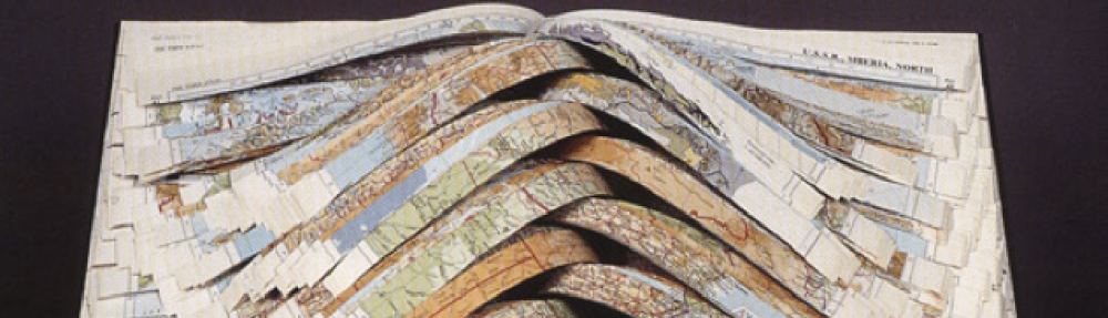
What makes this book especially fascinating is its interactive construction. Several pages include three-dimensional or movable parts that require the reader to physically engage with the book. For example, there is a pop-up fire truck that bursts from the center of a red spread, creating a sense of motion and urgency. Later, a fold-out sequence titled “Things Were Breaking” opens in multiple directions to show drawings of broken appliances such as a microwave, a laptop, and a VCR alongside an X-ray of Lin’s broken leg. At the center of that fold-out, the story connects the fragility of technology and everyday objects to the fragility of the human body. Another memorable feature is a layered, lift-the-flap self-portrait where Lin’s drawn face can be peeled back to reveal her skull and then her brain underneath, a striking visual metaphor for introspection and trauma. There is also a smaller liftable cut-out of her hospital figure, with clothes that can be “removed” to show her body underneath, referencing her emergency treatment and vulnerability.

The text narrates Lin’s real-life bicycle accident in Montreal in 2011 and her recovery at the Montreal General Hospital. The story moves from the day of the crash, when a truck hit her bike, through her time in the hospital and her gradual process of healing, both physical and emotional. Throughout, Lin mixes seriousness with flashes of humor, writing in a reflective, conversational tone that feels honest and deeply human. The book ends with her acknowledgment that memory changes over time and that, while the accident feels partly fictionalized now, her scars remain as proof of what happened. The final page is signed “Jenny Lin, 2012,” in her own handwriting, with a small drawing of her leg again, bringing the focus back to the body as both subject and document.

Even though it is a small, handmade book, Skinny Leg feels monumental because of how it uses its physical form to tell a story. Every page turn, every fold or flap, mirrors the bodily experience of trauma, vulnerability, and recovery. The materials themselves, paper, glue, thread, and ink, become part of the storytelling. When you hold it, you can sense the care and attention that went into its making. It is an artwork you do not just read, you experience it through touch, motion, and time.

When I first opened Jenny Lin’s Skinny Leg, I did not know what to expect. At first glance, it looks almost like a comic book with its black line drawings and short bits of text, but as soon as I started turning the pages, it became something completely different. The book felt alive in my hands. I realized that reading it was not just about looking at images or words, it was about handling the book, touching it, and interacting with it. The more I moved through its pop-ups, fold-outs, and cutouts, the more I understood that this physical engagement was not just a design choice, it was the point.

In Skinny Leg, Lin uses the structure of the book itself to tell the story of her accident and recovery. Every color, fold, and layer echoes her experience of injury, pain, and healing. The physical act of turning the pages mirrors the slow, careful process of regaining movement and control after trauma. Rather than writing about her recovery in a straightforward way, Lin makes the reader literally feel it through the way the book is built.

The feature that stood out to me most was the book’s interactive design, especially the pop-up and fold-out pages. The “Things Were Breaking” section, where everyday appliances are drawn alongside an X-ray of her broken leg, really stayed with me. As I unfolded each flap, I noticed that everything, the toaster, the DVD player, the laptop, was coming apart. By the time I reached the middle and saw her fractured leg, it felt like I had physically opened up the moment of the accident myself. The fold-out was not just an illustration, it was an experience.

This structure makes the reader take part in reconstructing the story. When we unfold the pages, we are “unfolding” her memory, and when we fold them back, we are helping to put it together again. It is subtle, but it made me think about how trauma is something you have to keep revisiting in order to process it. The book does not let you stay passive, it forces you to move slowly, to pay attention, and to handle it with care.

The color choices work in a similar way. The red pages feel like moments of impact and chaos when the crash happens or when she is in pain, while the white pages feel calmer, like a breath or a pause. Turning from red to white almost feels like taking a deep breath between memories. The few black pages are moments of total darkness, when she cannot see or think clearly. In that sense, Lin turns color into emotion. Each shift reflects her physical and emotional state.

It is impossible to read Skinny Leg without noticing how the book constantly compares itself to a human body. The front cover shows a single leg, drawn in Lin’s distinctive black line style, while the back cover features a garbage truck, a machine that appears multiple times inside the book. At first, the truck might seem random, but it starts to feel symbolic, a mechanical force that crushes and collects, like the truck that struck her bike. The garbage truck also connects to the body’s ability to process pain and remove what is no longer needed, almost like emotional waste.

Inside, this metaphor becomes literal. When Lin includes a pop-up fire truck bursting off the page, or the lift-the-flap self-portrait that reveals her skull and then her brain, the book becomes a living body, fragile, layered, and exposed. The flaps and seams function like skin and muscle, holding together the story’s physical and emotional content. To get to the inside of her story, you have to open up her body, layer by layer. It is a little unsettling, but that is exactly what makes it powerful.

This idea that the book itself acts as a stand-in for the body is one that appears often in book arts, but Lin’s version feels especially personal. Her hand-drawn lines and handwritten text emphasize her presence on every page. You can almost picture her sitting at her table, drawing each stroke, reliving the accident through ink. The entire object becomes a self-portrait, but not just of her body. It is a portrait of her process of remembering and healing.

What makes Skinny Leg so moving is how it uses touch as a form of empathy. The interactive features make you physically participate in her experience. You lift, unfold, and turn pages gently, almost as if you are taking care of the book. It reminded me of how fragile someone can feel after an accident, both physically and emotionally. You have to handle them carefully, and that is exactly what Lin makes you do with her book.

It also made me think about how trauma can live in the body, not just in memory. Elaine Scarry, in The Body in Pain, writes that physical suffering resists language because it is almost impossible to fully describe what pain feels like. Lin seems to answer that challenge not with words but with design. She does not just tell you how it felt, she makes you experience it through the book’s physical structure. Every fold and hinge carries meaning, like a scar that never fully disappears.

When I was turning the pages, I found myself slowing down because I did not want to rip anything. The book feels delicate, and that fragility made me more aware of my own movements. That is when I realized that Lin is not only telling her story but teaching the reader to move through it with sensitivity. Reading Skinny Leg becomes an act of care.

Another layer of the book that really stood out to me is how Lin includes drawings of computer screens and YouTube videos. At one point, she recreates a YouTube page showing a woman with PTSD from a bike accident. This part connects Lin’s personal experience to how trauma often gets shared or consumed online. Seeing a tragedy turned into digital content feels uncomfortable, and I think that is the point. Lin’s hand-drawn version of the YouTube interface highlights the difference between online representation and real, physical experience.

The book itself feels like a response to that digital flattening. Instead of scrolling or clicking, the reader has to touch and spend time with the story. The handmade quality of Skinny Leg, the uneven ink lines, the hand lettering, the visible folds, all of it makes it feel alive and personal, like a conversation between the artist and the reader. It resists the speed and detachment of screens, asking us to slow down and connect in a more human way.

The book’s ending brings everything together in a surprisingly quiet and honest way. Lin writes about how, over time, her memories of the accident have changed, that she has told the story so many times it has started to feel partly fictional, even though her scars are real. That line hit me. It captures how trauma does not stay frozen in one moment, it keeps shifting as we retell it, just like the folds and flaps of her book move and change with each reading.

The repetition of her leg as an image creates a loop, reminding us that healing is not a straight line. The book ends where it began, but with new understanding. By the last page, the reader has physically and emotionally walked through her recovery, and the book itself feels like it has healed along the way.

Jenny Lin’s Skinny Leg transforms the artist’s book into a living, breathing record of trauma and repair. It is not just about a bike accident, it is about what it means to piece yourself back together afterward. The physical form of the book mirrors the human body, which is fragile, layered, and resilient. Through color, texture, and interaction, Lin turns reading into an act of empathy. The reader’s hands become part of the story, mirroring the hands that drew, printed, and rebuilt both the book and the body it represents.

What I find most meaningful about Skinny Leg is that it does not separate art from life. The accident becomes art, and the art becomes part of her healing. It is a reminder that books, like people, can carry pain, memory, and transformation within them and that sometimes the simple act of turning a page can feel like a small gesture of care.

Biography of a Book – Celestial Navigation

Unfolding the Object – The Structure of Celestial Navigation 

Holding Karen Hanmer’s Celestial Navigation in my hands for the first time, I immediately realized that this book refused to be read in a single “traditional” way. It did not want me to turn pages but rather asked me to unfold space. Hinged triangles opening across the table, lifting into small pyramids. With this piece of Art, reading becomes a kind of positioning. Each fold is an active decision about where to stand.

The book unfolded to reveal the star constellations printed across its triangular panels.

The object is made from pigment inkjet prints on thick board. A dark field of stars covers the surface. White labels name the constellations and instruments. Each triangle is about fifteen centimeters per side, joined by narrow black hinges that let the whole thing bend and re-form almost freely. Closed, it is the size of a small notebook, about 6.75 by 5.75 by 0.5 inches. Open, it extends to roughly 17.5 by 30 inches. Both faces are printed. One side shows a nineteenth-century star chart, while the other side shows engraved images of astronomical tools like a quadrant, an astrolabe, a sextant and a telescope. You can lay the work flat like a map or raise parts of it into shape. The format invites touch and decision.

Across the stars there are only a few lines of text. “I don’t remember what you looked like.”, “I see your face in the stars.”, “Each remembers the sound of your voice.” The sentences are plain. They come in as signals. They do not explain themselves. The artist describes the work as a brief poem set against a catalog of instruments and a NASA photograph of the Milky Way (Artist’s Book News, 2008). That pairing is what matters. Precision beside memory, navigation beside absence.

A single folded pyramid with the printed line “ I don’t remember what you looked like”

The sources sit in the colophon. Alexander Jamieson’s Celestial Atlas (1822), Tycho Brahe’s Astronomiae instauratae mechanica (1602) and Joseph Moxon’s A Tutor to Astronomy and Geography (1674). These sources connect the work to a long history of mapping the sky. When the book is opened, its panels unfold into a network of connected triangles, each meeting at an edge to form small corners and seams. Some words run across these folds, continuing from one panel to the next. 

This copy is number fifteen of an edition of thirty. It is signed and lives in the Special Collections at San Diego State University (call number N 7433.4 H356 C45 2008). The hinges show small signs of use and the edges are slightly worn. Otherwise the condition is excellent. Because each copy is hand-assembled, there are small differences from one to the next. That matters. It reminds me that even with the same instruments, navigation still remains personal.

As an object, the book comes out of the artist’s book tradition where form does the thinking. The triangular system is not decorative but functional, determining how the pages open and close. Triangles fold and unfold, aligning and realigning with each movement. The reader’s eye moves from a word to a star name to a diagram, following a rhythm set by the hinges. The work is designed for a slower pace, as if each shape needs a moment to settle before the next one forms.

Celestial Navigation partially folded into an open triangular form that allows the viewer to look into the structure, creating the illusion of space and infinity

In the end, Celestial Navigation feels like a map that unfolds at its own pace. The stars, the diagrams, the brief lines of text, never holding a single shape for long. With each turn of the hand, something new comes into view, drawing fresh lines between image and word. The book asks for patience. It wants to be handled slowly. Through this quiet movement, it shows that reading can also be a kind of finding one’s way.

The Beautiful Infinity of Celestial Navigation

Self-created visualization. Me inside the folded space, looking toward its imagined infinity.

What first drew me to Celestial Navigation was its shape. I had never seen a book like it before. I had held scrolls, codices, artist’s books in boxes or sleeves, but never something that folded into a constellation of triangles. The form itself felt like a small discovery. It carried its own sense of curiosity, as if the book had been built to ask what else a book could be.

What fascinates me most is how directly it connects to what I have been thinking about for weeks: books as spaces. Here that word has a double meaning. It is space as in the universe, with stars, constellations, navigation, but also a space as in room, structure, physical presence. Hanmer’s book brings both together until they almost mirror each other. The pages are literal pieces of space, hinged rooms that can open, shift and connect. Each triangle feels like its own small chamber. The reader moves from one to the next the way a traveler moves through connected rooms. Every time the panels are rearranged, a new space appears.

The artist provides the materials and the furniture and the reader can design the interior, becoming the architect who arranges them. The book is what you make of it. Its geometry is open to interpretation and every configuration builds another kind of room. When I fold the triangles into pyramids, it becomes a three-dimensional structure, something that occupies actual space instead of lying flat on the table. Suddenly the book looks outward, projecting into the room, asking to be seen from different angles. It is no longer a surface but a small architecture. At one point, while carefully experimenting with possible alignments of the triangles, I arranged the panels so that one triangle opened toward me like a doorway. And that was the moment it hit me. Suddenly I could look into the book, not just at it. The light caught the inside planes and left the center dark. It was the first time a book had ever felt like a literal room. Something with depth that I could almost enter. That was the moment when I realized how much this book really stood apart from any other book I had ever seen and it perfectly connected to my ongoing thoughts. The book as an interface, as a space the reader inhabits. In Celestial Navigation this metaphor becomes reality. The book constructs an interior. It builds a space that exists between text and reader, image and body.

The connection to outer space deepens it even more. When the folded book stands before me, its dark interior looks like a pocket of the cosmos. The farther I look inside, the less light reaches the center. The printed stars at the edges fade into shadow until they disappear. It feels like looking into infinity. Like staring into a miniature universe made of paper. What I find remarkable is that this effect arises entirely from form rather than digital illusion or cinematic tricks. It is a planetarium built out of pages. 

I have always loved planetariums. The experience of lying beneath a dome of projected stars is one of total immersion. You feel both small and completely surrounded at the same time. Hanmer’s book somehow recreates that feeling at the scale of the hand. I can hold this universe between my palms. In that sense, it becomes a pocket planetarium. A literal space in my pocket. What strengthens that effect is the simplicity of the text. “I don’t remember what you looked like,” “I see your face in the stars,” “Each remembers the sound of your voice”. Scattered among the stars, these fragments do not tell a story. They echo softly through the space of the book. They are signals, small transmissions. Because there is so little text, the gaps become part of the experience. The emptiness around the words feels immense, like the vast distances between stars. Even when a triangle carries more text, it never fills the frame. Everything remains surrounded by open sky. Within that scale, even long sentences appear small, perfectly capturing a key aspect of space: In the vastness of the universe, even the largest structures seem tiny.

The book fully unfolded to display short textual fragments scattered across its star fields.

For me, that spatial contrast between the smallness of the triangles and the vastness they suggest, is what gives the book its emotional weight. The scale reminds me how memory  works. Fragments floating in the distance, each one distinct but connected by invisible lines. Hanmer’s pairing of precise astronomical diagrams with these personal, almost fragile sentences turns navigation into a metaphor for remembering. The instruments mark position, the voice marks loss.

What also fascinates me is the sense of active participation the book demands. Because the structure can be arranged in countless ways, no two readers will ever have the same experience. Each person chooses where to begin, how far to unfold, what shape to stop at. Reading becomes an act of design. That interactivity makes the reader part of the book’s authorship. It feels intentional, as if Hanmer wanted each viewer to become a part of the book, shaping a personal constellation out of shared materials. I noticed this most clearly when I began to handle the book myself. I started turning the triangles, folding them backward, building small forms, reversing them again (very carefully). The process activated something creative in me. It made me think through movement. The book sparked the same kind of energy I feel when I make something myself. When an idea I have suddenly gets shaped and turns into a form I can hold. The difference is that here the form already exists, but its meaning is still very much open. My task is to discover it through motion.

That openness is what makes Celestial Navigation so distinct. Most books, even artist’s books, guide the reader through a predetermined sequence. Hanmer’s piece does not. It offers possibility instead of instruction. The hinges act like coordinates through which the reader plots the route. The act of navigation is both literal and conceptual. Just as celestial navigation in history relied on observing fixed stars to find one’s position, Hanmer’s book requires attention to movement and relation. Meaning arises not from what the book says but from where it is placed and how it is held. That way, every reading becomes a unique experience. The form ensures that the book will never look exactly the same twice. The next person who unfolds it will see different constellations of triangles, different alignments of text and image. In this sense, Celestial Navigation reflects the universe it depicts. Limitless in potential arrangement. Just as the cosmos has no single center, this book has no single way of being read.

When fully unfolded, the pattern of triangles spreads like a map or even a game board. I find myself tracing a path across it, triangle by triangle, as if I am moving along a route. Each segment offers a new image or a short phrase, either a stop or a step. That movement through panels feels like walking through rooms. The geometry becomes a kind of architecture of attention. The three-dimensional form intensifies that sense of scale. The book can rise into small pyramids that reach into the air, escaping two-dimensionality, as if the stars printed on its surface had begun to lift off the page. When I look into one of these pyramids, I see both the physical material and the illusion of endless space. The experience folds outer and inner worlds so that I am both in front of the book and inside it.

Two folded pyramids side-by-side, illustrating the books, modular geometry and its vast range of possible rearrangements.

That merging of worlds is what makes Celestial Navigation resonate so strongly with the ideas Amaranth Borsuk discusses in The Book. Borsuk writes that “the book accommodates us, and we accommodate to it.” (Borsuk, p. 198) Hanmer’s work performs that exchange literally. The book moves with my hands as I move with its geometry. The interface is physical, the dialogue is spatial, turning reading into a quiet exchange. In this way, Hanmer carries the idea of the book as interface out into the cosmos. Her work does not simply represent the universe. It builds one. Reading turns into a way of finding direction, of learning how to move through the dark. The reader becomes a navigator, aligning fragments the way sailors once aligned stars. Every repositioning of the panels becomes a recalibration, a way of asking, where am I now?

That question stayed with me long after the book was closed. The memory of holding Celestial Navigation remained, partly in the hands, partly in thought. It reminded me that space, whether cosmic or on the page, is never fixed. It is something we build as we move through it. Hanmer’s book holds that truth gently, offering the tools, the constellations, the fragments of a voice and leaving the rest to us. Each time I returned to it, the configuration changed. The triangles met at new edges, shadows fell differently. I realized that the book’s real subject might be attention itself. The way focus shifts, the way meaning appears only through relation. The form teaches me to look slowly, to accept that not everything must resolve into a single pattern.

In the end, Celestial Navigation turns reading into an act of navigation, of orientation through memory, light and touch. It shows that a book can be both a map and a space, an object and an environment. Hanmer’s structure makes the reader part of its constellation. It is a book that asks not to be read, but to be explored, acting as a gentle reminder that meaning, like the stars, depends on where we stand when we look.

Conceptual visualization digitally created from the pages of Celestial Navigation. The book becomes a boundless cosmos, unfolding into the infinity it evokes.

Biography of Pliny the Elder’s Naturalis Historia

Physical Biography:

Interpretation of Most Intriguing Feature:

After spending two hours examining the physicality of Pliny The Elder’s Naturalis Historia, the most mysterious feature were the final two pages completely stuck together, with unintelligible penmanship bleeding through. It would seem that this handwritten note was sealed away from readers on purpose by a former owner of this copy as a mode of censorship. By sealing this secrecy between the two pages, future readers are forced to grapple with pushing past the words on the page, and to appreciate the book as a concept rather than the book as content. While it is unclear the true reason why this intriguing attribute exists, the reason why it is important is because these final pages contradict the book itself; it is an encyclopedia of natural history, yet neglects to inform readers of everything within its pages. This written detail is an inaccessible part of the book’s history. Whoever owned this book before San Diego State became its home knew the power of words on a page, and knew how to leave readers hanging by a thread.

Upon my final few minutes with Naturalis Historia, an incunable book, I discovered truly the most intriguing aspect, which was barely noticeable writing bleeding through a concealed page. When I noticed this hidden handwritten note, I immediately knew that this was what I wanted to talk about. I want to talk about something I can’t even see. In fact, it is so difficult to recognize that I was stuck trying to interpret Jacobus Goellius’ signature literally the page directly next to it without even assuming more penmanship would appear. Typically, when I see a signature, I generalize that it is the end of something, whether it be a legal document or a letter. In this case, when I saw “Jacob Goellius” impressively signed at the end of the hand-pressed text, I figured it was the conclusion to the book as a whole. 

However, one has to remember everyone involved in the bookmaking process in fifteenth century Venice. At this particular print shop, the printer, Rainald di Nouimagius Alamanni, had this edition decreed during the reign of Giovanni Mocenigo. Just in his name alone, we can see the importance of the birthplace of bookmaking skills in relation to Germany, and how Italians used “Alamanni” to identify German descent and craftsmen. In one way or another, this title demonstrates a level of respect for the people who engage with books, making scientific knowledge and power more accessible to others. Similarly, by mentioning whose reign Nouimagius printed this book under, there is a political message identifying the overarching power of the government at this time. It is clear that politicians were well-respected and elevated on the hierarchy of power, dominating even printing presses distributing books. 

That is why when we think of book history, we must consider the sociology of the people during the time as well. There are lines of overlap with people in power and people not in power, building tensions between the relations made from one single book. For example, Aldus Manutius’ career with the Aldine Press overlapped with Nouimagius’ which creates an intricate network of people who collaborate and dedicate their lives toward this industry. While I am unaware of Nouimagius and Manutius’ relationship, I know that when I try to research more about Nouimagius, Manutius’ name appears instead. Even though Nouimagius contributed greatly to book history, gifting San Diego State Pliny the Elder’s incunable book, it is nearly impossible to find detailed information on him without learning about Manutius simultaneously. This goes to show the power structures of successful people five centuries ago still remain today based on how much one made an impact on a particular industry. Among hundreds of other printing houses during their time, Manutius is the most popular, not Nouimagius.

Given that we know of how Noumagius could’ve worked with other craftsmen on Pliny the Elder’s reimagined Natural History, one of these craftsmen might’ve left this handwritten message in the back of the book. However, if it were either Noumagius himself or other craftsmen, I doubt they were writing some personal letter or coded note to a future reader. Rather, I am leaning more toward the argument that their note would be more closely related to the general printing, possibly regarding page numbers and orientation. Similar to how there are signatures indicating the end of specific sections—like “d i”—to aid the bookbinding process, I would imagine this message was a possible guide for Nouimagius and his team. Therefore, it would make sense for them to seal these papers together since they might not deem this writing necessary for scholars of content. Of course, when they are printing the books, they do not consider how people like me, five hundred years later, would try to uncover what this writing might mean to the history of this book.

The main indicator as to why I believe it was neither Nouimagius nor others is the page just before with Jacobus Goellius’ notable signature. With such a flamboyant and attractive name, one might not stop to consider the censorship just above his name, covering another person’s signature or handwriting. With a censored signature above and Goellius below, it leads to consideration that Jacobus Goellius might’ve covered this person’s name because they were a previous owner. Without being able to read the writing below this covering, it is nearly impossible to discern if it is even the name of a previous owner. And, even if it was a name, retrieving who might’ve had ownership of this text is equally, if not more, difficult to find. After researching who and when Jacobus Goellius is, on Pantheon.world, he made notable contributions to Mathematics and Latin and Arabic studies in the early to mid-seventeenth century, more than one hundred years after this book was printed. It is possible he studied aspects of this book pertaining to these specializations, but that does not explain why he would write his name in the book, or decide to use Naturalis Historia for that matter. Considering its size and decorative elements, it is most likely that, at the time of its printing and for several years after, Naturalis Historia belonged to a church or university in Venice, Italy. Therefore, only people with power and scholars of these institutions had access to such knowledge since public libraries and portable books were yet to become popularized. 

A more important question, therefore, might be: why does Jacobus Goellius, a man from the Netherlands, care about what is in a book in Venice? Thomas Erpenius was Goellius’ teacher at Leiden University, who instructed him in West Asian language studies including Arabic, Persian, and Turkish. During Erpenius’ career, he traveled to myriad places, finding time to stop in Venice, Italy to perfect certain languages. It was there that Erpenius might have made contact with Pliny’s Naturalis Historia printed in 1483. I have tried many times over to find where the copy of this book truly resided, but have failed to find its exact and original home. Even though Erpenius studied at Venice of Jewish Instruction, there is no written record that Nouimagius’ 1483 print was held there. In spite of this, I still consider it reasonable to hypothesize that Erpenius encountered the text here or, quite possibly, became an owner of it. During the years between Nouimagius’ printed copy of Pliny the Elder’s manuscript and Erpenius’ visit to Venice, personally owned books were made popular by the Aldine Press. Somewhere lost in history, this text could’ve been owned by more individuals besides the obvious Jacobus Goellius. Since Erpenius was succeeded by Goellius as the chair of Arabic and Hebrew studies at Leiden University, Erpenius could have passed Naturalis Historia down to Goellius, thus reasoning why his name is signed in this copy. Then, we could conclude that the name or writing covered above Goellius’ signature was Erpenius.

If Goellius was willing to cover his predecessor’s signature, it would not be unreasonable to consider the fact that he might also censor writing in the back of the book. Perhaps he didn’t have any malintentions, but it would seem this act was performed purposefully. From my observations, these pages were nearly seamlessly adhered together, making it close to impossible for this to be any accident. Once again, if Goellius were to have sealed these pages together, it was most likely under the impression that whatever was written on these pages was unimportant to other scholars. Maybe he was even concealing personal details or notes Erpenius might’ve left before he died at just forty-years-old. Whether he was hiding secretive notes or censoring unnecessary annotations, Goellius understood these words would change the book’s history. Whoever wrote in this text, left their mark, no matter how hard Goellius tried to cover it. 

After all of this research on Pliny the Elder’s Naturalis Historia printed in 1483 by Nouimagius, we have hardly discussed what was actually written in this book. That is because books are not only important by the information they provide but also by the information yet to be discovered. One might stop to consider the importance of every page in a given book glued together with intent, and question not the words on the pages but why they were concealed. We have not learned about the significance Naturalis Historia has in relation to Pliny’s ceaseless research, but in relation to the sociology and censorship of knowledge. When Nouimagius printed Naturalis Historia, the book likely ended up in a funded institution, exclusive to people in power. After many years, more scholars accessed the information in this text until, bit by bit, relevant documentation was made permanently inaccessible. After New York’s Bern Dibner Library Bern Dibner Library (where this book was collected along with other incunables) permanently closed, it traveled to the Huntington Library, Art Collections, and Botanical Gardens in San Marino, California before finally ending up at San Diego State University’s Special Collections. While this particular copy is not held at a public library, you can still access free translations and versions both online and at public institutions. However, since Nouimagius’ incunable version holds more value in its age and history, it is kept in a more conserved location in Special Collections. The life of this Naturalis Historia is just one demonstration of how the power of a particular book doesn’t just pertain to the content but also the overall concept of it. Nouimagius’ book is not worth hundreds of thousands of dollars because of its content, it is more valuable because of its concept; the life it has lived is longer and more historical than anyone observing it. It is an ancient artifact of human sociology, politics, and culture. That is why it doesn’t necessarily matter what writing the pages hide, but why the pages hide this writing in the first place. In order to make an educated guess as to why, it is necessary to dive into almost every aspect of this book’s life to discern something that could otherwise be easily answered if there wasn’t five-hundred years of history to this book. 

Learning about Rainald di Nouimagius Alamanni’s printed version of Pliny the Elder’s Naturalis Historia was no easy task. However, as I encountered multiple challenges such as its age and even that it was typed in Latin, I also learned to appreciate this book for its physicality. Because I’ve only known and read mass-produced books, I’ve only ever learned to read the words on the page rather than the pages, materiality, and history. By taking on a challenge to identify historical and sociological relevance of San Diego State’s Naturalis Historia, I gained experience in interdisciplinary research and scholarship. I also gained a new perspective on reading books not in what they contain but how they reveal themselves to their readers.

Works Cited

De Bruijn, J. T. P. “Golius, Jacobus.” Encyclopedia Iranica, Iranica Online Vol. XI, Fasc. 1, p. 96, 3 June 2013. GOLIUS, JACOBUS – Encyclopaedia Iranica

Encyclopedia.com. “Erpenius (van Erpe), Thomas.” Erpenius (van Erpe), Thomas° | Encyclopedia.com

“Erpenius, Thomas.” 1911 Encyclopædia Britannica, Volume 9. 1911 Encyclopædia Britannica/Erpenius, Thomas – Wikisource, the free online library 

Mark, Joshua J. “Alemanni.” World History Encyclopedia, 10 September 2014. Alemanni – World History Encyclopedia 

Massachusetts Institution of Technology. “The Burndy Library has moved and the Dibner Institute has closed.” Burndy Library | Dibner Institute

Pantheon. “Jacobus Golius.” Jacobus Golius Biography | Pantheon

Smith, Dr. Lorenza. “Aldo Manuzio (Aldus Manutius): inventor of the modern book.” Smarthistory, 28 March 2019. Smarthistory – Aldo Manuzio (Aldus Manutius): inventor of the modern book Smithsonian Institution Libraries Publications, Incunabula Collections. Incunabula From the Dibner Library of the History of Science and Technology

Biography of a Book: The Golden Legend, Wynkyn de Worde, 1527

Bibliography

This copy of the Golden Legend, first written in Latin by Jacobus de Voraigne in 1265, is the ninth edition of a William Caxton English translation, printed by Wynkyn de Worde on August 27, 1527, on Fleet Street at “the sygne of the sonne,” according to the book’s colophon in folio CCC.LXXXIIII. The volume is bound in brown leather with embossed gilding and decoration. “NOBILIS IRA” has been stamped on the front cover of the binding as well as the image of a lion—the family motto and crest of Clan Stuart of Bute, a wealthy family of Scottish nobility. It is a heavy and large book, printed at full folio size before trimming. The interiors of the front and rear covers show some water damage.

Binding of the Golden Legend showing crest and motto of Clan Stuart

The spine of the book bears six horizontal hubs. The spine is embossed in gilt with “THE GOLDEN LEGENDE” at its top and “W. DE WORDE. MCCCCCXXVII” in its center with a series of decorative gilt knots embossed in the other recesses between the hubs. The joint and hinge of this cover are in excellent shape, as are most of its pages. The book is accompanied by an undecorated solander case made of cardboard and faux leather, likely of much later origin than the binding and pages of the codex.

The pages of this edition are cloth rag, and they have gilding on all three exterior edges. There is some light dampstaining on the first few pages of the book and the last few. The center pages of the book are in excellent condition and some folios are pristine. Watermarks are visible at the center of most pages throughout the book, bearing the image of a star below an open palm. The blackletter text in which this work was printed has held up very well and the letters are clear and sharp throughout. Unlike earlier printings, this ninth edition does not have red drop cap lettering. Wynkyn de Worde was known for his illustrated copies, and there are many woodcut images stamped throughout this copy of the Golden Legend, some incorporated into the formatting of the text, others taking up full pages (Gillespie & Powell 30). Where the title page would typically be, there is a full-page illustration of many saints gathered around the throne of God. This page appears to have been repaired with newer paper, and one can see where the edges were once tattered by the years.

Artwork on first page, AIJ

There are several bookplates glued to the inside of the front cover and to the frontispiece. Inside the front cover a bookseller’s plate is glued to the top left corner reading:

1652 Legend Aurea; That is to say, in English, The Golden Legend; wherein be contained all the High and Great Feasts of Our Lord, the Feats of our Blessed Lady, the Lyves, Passions, and Miracles of many other Saintes, Histories and Acts, black letter, with woodcuts, folio, remarkably fine large copy, Morocco elegant, gilt leaves, EXTREMELY RARE, 52l. 10s. – London by Wynkyn de Worde, 1527. One of the most splendid specimens of this early printer’s productions.

Below this plate it can be seen that a bookplate has been removed at some point in this edition’s life. Below the adhesive residue where the old plate was, there is a bookplate with the image of a fine medieval building. In very small print the facade of the building bears the words ALDENHAM ABBEY. The bookplate glued below this gives a case, shelf, and room number. However, a plate from the Tempsford Hall Library has been glued over the top of it, denoting Case C, Shelf 4, and asking the reader to “Please return this Book to its place when done with.”

Underneath the Tempsford Hall plate is a more modern plate from the twentieth century reading “THE LIBRARY OF DAVID AND LULU BOROWITZ.”

Inside front cover: bookplates, water damage

The frontispiece has a fourth bookplate glued to it, this one larger than the rest, decorated with a coat of arms depicting a griffin-plumed helmet resting on the top edge of a shield. The crest’s motto reads “ET CUSTOS ET PUGNAX.” “Ex Libris” is written at the top edge of this plate, and the bottom edge reads: William Marchbank. This plate seems to be of an older paper than the Borowitz plate, but not as old as those of Tempsford Hall and Aldenham Abbey, so it is reasonable to estimate it is from the early twentieth to late nineteenth century. This plate also appears to be glued over the top of another of the same size and inscribed with the same message and crest. All that appears to have changed between the two is the font of William Marchbank’s name at the bottom and the material of the plate itself.

A letter has been glued to the frontispiece of this edition, presumably by a later bookseller. The letter is written in cursive on letterhead from the Bodleian Library at Oxford, dated May 11, 1850. It is accompanied by a loose envelope addressed to Henrietta Street in Covent Garden, London, sent to Thomas Thorpe, a bookseller in the capital. The envelope reads: “Relating the Golden Legende. May 1850” and bears several postal stamps from 1850 while the letter was in transit. The letter reads:

11/5/50

Dear Sir, I have carefully examined our copy (in the Douse Collection) of the Golden Legend, by Wykkyn de Worde 1527. There is no leaf between the Frontispiece and AIJ. Douse considered it perfect, only remarking that the impression from frontis plate was the worse for frequent use. As far as I could keep into the back of the sheet without injuring the Book, it seemed to me that the plate was struck off on the half of the last folding – so as to prove that it was an Ai- I shall be glad at all times to make any search of this nature for you. I am glad to find that your country air has restored you. I wish I could get away from Oxford for a little while, but I am afraid to go too far from my [unknown] Medical friends until the weather has become really genial—besides which I have a great deal on my hands at Bodley at this moment. Believe me. Yours faithfully, M Banchmil.  

Some of the words are difficult to decipher in the cursive text of the letter, but it is apparent that these two booksellers were well acquainted with one another, as Thomas Thorpe is listed in many letters held by the Bodleian Library’s archives in correspondence with the booksellers at Oxford.

Frontispiece: letter, envelope, bookplate

There is writing in pencil on the top of the inside cover that may read “Miss lj,” though I cannot make it out too clearly, and this appears to be a part of an inventory code Thomas Thorpe kept with many of the books he sold. The pencil inscription on the top of the frontispiece reads “3500 ww373,” and a final pencil inscription at the top left of the next page bears the call number of the book: BX 4654 J33 1527 to Special Collections, likely placed there when the book joined our archives along with the small stamp at the back of the frontispiece that says, “San Diego State University Library Special Collections.”

Analysis

The pedigree associated with this book is extraordinarily compelling. For much of its near-five-hundred-year existence, we can trace the movements of this edition of the Golden Legend down to the address of its residence and the shelf it has been stored on. The meticulous documentation that accompanies this book suggests to me that it has been an object of great importance since the day it was printed. The letter of sale attached to the frontispiece gives us an insight into how this book was viewed in 1850, and likely through the centuries before and since: as an object of immense value, whether socially or monetarily: a status symbol since the first days following its printing on Fleet Street in 1527 to its ultimate resting place in our Special Collections Library.

Wynkyn de Worde was a student of William Caxton. Born in Germany, he immigrated to England in 1476 in order to work under Caxton, ultimately taking control of Caxton’s business following his death in 1491. Wynkyn de Worde is credited as one of the instrumental early players in London’s printing scene. According to Fleet Street Heritage, he established the first print shop on the now famous Fleet Street in circa 1500 and set out on a prolific career in the industry, “in all, it is estimated that from 1501 to the close of his career [in 1535], Wynkyn printed over six hundred titles, several of which survive today.” He “seems to have sought to develop markets, particularly for smaller, hence cheaper books, that required less capital investment and could be produced more quickly,” though it is clear that this edition of the Golden Legend is not one of those books (Gillespie & Powell 30).

While de Worde made an effort to establish markets for the less affluent, he also had established connections within the hierarchy of the English nobility. He was a close associate of Lady Margaret Beaufort, King Henry VII’s mother, and was even named her printer shortly before her death in 1509. The Companion to the early Printed Book in Britain claims, though it is unclear, that Lady Margaret may have provided some assistance to Wynkyn de Worde, whether through monetary backing, or guaranteed purchases of a set number of copies, or it could be that association with her name provided a boost to sales (Gillespie & Powell 31). In any case, the colophon’s reference to the reign of Henry VIII suggests either that Henry’s reign held a strong grip on British society in 1527 or that de Worde was close with the crown, likely both.

Knowing that Wynkyn was making concerted efforts to lower production costs of his printing, it is easy to understand his movement away from using red ink drop caps in the text, and although it is printed entirely in plain black blackletter, the book is still rendered beautiful by the integrated woodcuts throughout and the masterfully decorated leaf that would have come before the now missing title page. This was very much created as a work of art. Many of Wynkyn de Worde’s printings were smaller, and so the page sizes of this copy of the Golden Legend alone speaks to the importance of this particular edition. A person could not and would likely not have wanted to purchase this book in its day unless they were extremely wealthy.

First page of text showing blackletter, woodcut, black ink drop caps

 And although we do not know who the first owners of the pages of this codex were, we can assume that they would have been deeply religious Catholics, as England was still a decade away from the reformation. This would have been a book of great importance in the owners’ homes, and following the reformation, the stories within telling of the lives of the saints may have been a way for its readers to maintain their catholic heritage.

While the first few pages have been frayed and repaired, a hint as to their usage, the excellent condition the rest of the pages are in and the gilded edges all suggest that this book was moving between the shelves of the rich and powerful before winding up in the Bodleian Library sometime in the first half of the nineteenth century. The Bodleian is one of the foremost institutions of knowledge-keeping in the world. Very little arrives there by accident.

M Banchmil, bookseller at the Bodleian, then sold this copy to Thomas Thorpe, whose bookshop was located at 13 Henrietta Street in Covent Garden, London. Thorpe then, judging by the date of the bookplates and the binding, sold this to a member of Clan Stuart, the book going from Covent Gardens to Aldenham Abbey, near Watford, sometime after May of 1850. The book then traveled further north to Tempsford Hall, a building owned at the time by a Major Dugald Stuart (possibly the original purchaser from Thorpe of this copy of the Golden Legend) just west of Cambridge. Tempsford Hall burned to the ground in 1898, so we know that this copy of the Golden Legend must have been relocated to its new owner’s shelves before then.

It is most likely that this new owner was William Marchbank. Based on the heraldry on Marchbanks’ bookplate, we can see that his family was a part of the Clan Marjoribanks. The Marjoribanks clan is of some relation to Clan Stuart, tracing their joint lineage back to a fourteenth-century marriage between Robert the Bruce’s daughter Marjorie with Walter Stewart, whose son would go on to be the king of Scotland in 1371.

So, we have evidence that this book has been passed along the descendants of Scottish royalty, coming from a birth in the lap of the British royalty. It is likely that the Scots, remaining catholic following Henry VIII’s reformation and the creation of the Anglican church, would have continued to value the Golden Legend spiritually, possibly adding another layer to the clearly cherished nature of this edition.

Whether William Marchbank inherited this book, purchased it from some distant cousin, valued it religiously, or even opened it at all is unknown, but he must have owned the book for long enough to install two bookplates bearing his name and crest on the frontispiece before it went to its new home. Not much can be uncovered about Marchbanks, but this same bookplate appears inside a book at the Penn University archives (call number: EC F6253 650ec), so it can be assumed that he placed much value on his collection. Archival references in letters found at Trinity College in Cambridge suggest that William Marchbank was a knight and solicitor who managed the Drapers’ Fund during the second world war, but this cannot be wholly confirmed by the evidence.

In order for this edition of the Golden Legend to cross the Atlantic and make its way to us, it needed a very wealthy buyer. Enter David and Lulu Borowitz. According to obituaries found in the Chicago Tribune, the husband and wife lived lives of philanthropy and rare book collecting. Lulu spent WWII fundraising for the Red Cross, while David spent the early part of the century investing and founding the Bradley Manufacturing Company, which made lamps and lamp shades. The Borowitzes became a power couple in the book collecting world, donating large collections to Brandeis University and the University of Louisville, where David would be awarded an honorary degree for his contributions. Lulu Borowitz passed in 1987, and with David’s death the following year, this copy of Wynkyn de Worde’s Golden Legend left their shelves. Where it went next is unclear, but eventually the book was acquired by Special Collections, although due to record keeping at the time (or lack thereof), the date of the acquisition and who it was acquired from is not certain.

In a world where there are many old things passed along without record through family members or friends or antique shops, to find an object whose history can be traced at all is a rare feat, let alone one that has had hundreds of years of ownership recorded for posterity’s sake attached to it. When a numismatist picks up a very old coin, they often imagine who might have held it, what it might have been used to purchase. Old books are similar. But in this instance, we can know who turned the Golden Legend’s pages, we can know where they stored it and where they lived, and from that, we can know, in some small way, and with only the tiniest dusting of certainty, a bit about their lives. This tiniest dusting, however, will leave more of history’s traces on our fingers than so many of the things we will ever touch that arrive to us nameless.

To hold an object of this nature changes it from simple antique. The provenance of the piece urges us to view it as artifact; we are holding something that has communed with the past directly in a discoverable way. The book should speak to us of more ancient times, but rather than speaking in a hollow shout, it whispers to us as if confiding a very old secret: “This is what the world was before you came into being.” While it may be a very different world, one bearing the hallmarks of wealth and privilege, whether we are rich or poor now we are interacting with the same interface, turning the same pages, finding the same ink stamped in the same places telling us the same old legends, some of them golden. It is up to us to decide whether this gold bears the same value, or whether it has been tarnished by the hands that held it, be they made rich through blood and scheming—as was the case with Clan Stuart and the Marjoribanks, through a fascination with the word—in all its forms—by those that stewarded the Bodleian and by Thomas Thorpe, or through innovation—as we saw through the rise of Wynkyn de Worde, or through lamps—in the case of the Borowitz family.

While it is hard to ignore the value placed upon these pages that superseded many of the other things that must be valued in this life, for me, this book is still worth its weight in gold.