In class so far, we have discussed the cultural significance of blank spaces within text formats, but on Tuesday we had the pleasure of diving deeper into imagery and illustrations within texts. Dr. Pressman and our readings have mentioned that the blank spaces signify the cultural norm of silent reading. Similarly, the placement, positioning, and size of an image on a page “can propose an interpretation that is complementary, supplementary, or even contradictory” (Mak, 17). This idea connects directly to the aesthetics of the book, as imagery plays a key role in shaping how a reader interacts with and experiences a text. Whereas blank spaces guide the rhythm and pace of reading, illustrations often guide the focus and meaning of the content. The visual elements can elevate a book beyond its textual function, turning it into a cultural artifact that communicates through both language and design.
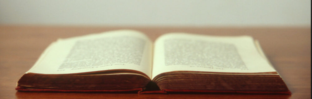
During our visit to the Special Collections Lab, we examined a botanical book in which the imagery was the central feature of the page. The detailed botanical illustrations were not just decorative, they were the primary conveyors of knowledge. The minimal text served a supportive role, naming or explaining what the images depicted. This visual display showed how illustration itself can embody meaning and serve as a scientific, aesthetic, and cultural tool. As Mak writes, “ illustrations can refer to the world beyond the page and participate in a wider discourse about the book that involves the social status of the particular codex, its designers, and its owners” (17).
In this botanical text, the intricate images did more than portray plants. They connected art with science. The precision of the drawings demonstrated scientific observation, while their elegant presentation reflected artistic intention and cultural value. This bridging of science and art through the combination of words and imagery shows the aesthetic power of the book as a medium. It demonstrates how illustrations can extend the book’s purpose beyond reading into seeing, experiencing, and even situating the text within broader social, cultural, and intellectual contexts.
The expansiveness of The Book as an idea, as an interface, as art, as an all-encompassing medium to which is molded for us, by us, to serve our needs. I found so many things intriguing in this reading, namely the expansiveness of the book as an Interface and how the page seems to be, not only a filtration system for human thinking but a shapeshifting medium at that. At the very basis, I like how Bonnie Mak grounded the page in its existence as being more than just mattering due to meaning or significance, “To matter is not only to be of importance, to signify, to mean, but also to claim a certain physical space, to have a particular presence, to be uniquely embodied.” (3) Similarly in Megg’s History of Graphic Design, there was sections of extensive research about how art expanded, evolved, and therefore become a direct influence to political and idealogical movements.
The idea of art being a proponent of ideological and social change isn’t new, but the literal influence of the page as space and a literal reflection of a harmonious future is. The De Stijl movement in particular stuck out, “Schoenmakers defined the horizontal and the vertical as the two fundamental opposites shaping our world, and called red, yellow, and blue the three principal colors. Mondrian began to paint purely abstract paintings composed of horizontal and vertical lines. He believed the cubists had not accepted the logical consequences of their discoveries; this was the evolution of abstraction toward its ultimate goal, the expression of pure reality.” (931-932) Art and Modern Art itself has really pushed the boundaries of its own medium (Comtemporary art/Abstract art) but I never really thought about its implications in terms of the evolution of the page as space and material. Abstract Art seems to be a space that can not only push the bounds of Art itself but also expand our thoughts and ideas upon which we frame or facilitate societal needs, demands, and exploration. Mak states, “Readers interpret text, space, and image, as they are inclined, but the meanings that they formulate are predicted upon the materiality of each carefully designed page.” (21)
The page has never been so multifaceted in my eyes, let alone The Book itself. I can now see the correlation between the page and so many other different ideas (Politics, the humanities, Science, etc.). It is an all-encompassing medium, both changing and willing to change for our (humanity’s) sake. The expansiveness of the book just keeps growing exponentially, much like Borges’s short story it feels infinite. For me, a quote that really highlighted just how grand a vision artists have in their art to not only influence art itself but people, was on page 937 of Megg’s History of Graphic Design: “Malevich and Mondrian used pure line, shape, and color to create a universe of harmoniously ordered, pure relationships. This was seen as a visionary prototype for a new world order. The unification of social and human values, technology, and visual form became a goal for those who strove for a new architecture and graphic design.”
“From a young age, we are trained to believe that the boundaries of the interface are always identical to the edges of the material platform of the page – namely, that the cognitive space and the physical dimensions of the page are necessarily conterminous.” (Mak, p.3) This was the sentence that really stayed with me this week, as immediately connected to what I have been thinking about lately: The book as a space, a sequence of rooms where every page could almost feel like its own small book.
“Boundaries,” “interface”, “conterminous”, Mak’s choice of words here make the sentence feel almost like architecture. The words sound like they are building something, setting up walls and lines that shape how we imagine reading. By calling the page an “interface”, Mak turns it into a place where the physical and the mental meet, where what we see starts to touch what we imagine. When she says that the “cognitive space” and the “physical dimensions” of the page are the same, it feels as if she is describing how we have learned to let our thoughts stop where the page ends. Where last week I thought of each page as a room, Mak now makes me realize that I have also been taught to treat the edges of that room as the limits of my thinking.
The word that stands out to me most is “trained.” It shows how much this way of reading is something we have learned rather than something natural. Words inside, white space outside. I never really thought about that before, but it is true. We have been trained to read like that from the very beginning. And what Mak reminds me of here is that this is just a habit. It is not something fixed. Habits can change. You can start to notice the frame and once you see it, you can move past it.
That’s what this sentence does for me. It makes those boundaries visible so we can start to think beyond them. It connects perfectly to what I felt last week. The idea that reading is not just about moving through pages but about moving through spaces. If each page is a room, then it also has a door. The edges do not only hold the text in, they also open it up. Seeing the page as more than a flat surface makes reading feel like a space again. One that does not end where the page does but moves past it. Into thought, into memory, into the next room that quietly waits to be entered.
The aesthetics of the page are important. This is something innately understood by most readers, even if they do not have the understanding of why. When we open a book and see long blocks of text, readers are subconsciously aware of a kind of gatekeeping taking place within its passages. Those who do not read often will think “this must not be for me,” or “this information is too complex for my understanding.” When we see smaller paragraphs, more white space, a simpler lexicon, the reader approaches it as if by warm invitation from the author. The page itself says, “come with me.” As Bonnie Mak says on page 5 of her introduction to How the Page Matters, the page “influences meaning by its distinctive embodiment of those ideas [on the page].” The page exists as “an ongoing conversation between designers and readers. As writers, artists, translators, scribes, printers, booksellers, librarians, and readers configure and revise the page, in each case they leave redolent clues about how the page matters to them and how they wish it to matter to others.”
When we open a book, look at a flyer, without reading a single word we can likely know who the work was created for and who it was created by. The modernist movements of literature, art, and design were integral to this. Among the most prominent writers of modernist literature is Ernest Hemingway, whose style was inspired by the work of impressionist painter Claude Monet. Monet’s later works, such as “The Water Lillies” would evolve to set the foundation for what would become expressionism. Both of these art forms have been very enduring in their wider appeal, much as Hemingway is often credited with doing “more to change the style of English prose than any other writer in the twentieth century” and whose works were published in clear, easy to understand, accessible formats. The Old Man and the Sea was published in Life magazine, so as to be accessible to more readers, and one anecdote in Lesley Blume’s Everybody Behaves Badly recalls a late-night reading of the book at a truck stop, of all places, to a room full of greasy drivers and people from the sticks and hollers of West Virginia: A waitress reads from the copy of Life. People are trying to order coffee from her, a jukebox is playing and is unplugged from the wall to better hear. “She says, ‘Shut up and listen’ And in the middle of the night, in this truck stop, she starts reading The Old Man and the Sea” (236). This work was for everybody. It has been enduring. Just like Monet. Just like the expressionists.
Other forms of modernism did not last, and their fates mirror those of the political parties they ascribed to. The Dadaists fractured into many smaller groups in a way that calls to mind the Communists’ sectarian splintering during the Spanish Civil War. Dada work was staunchly anti-bourgeoise, but it was created in a way that did not allow the proletariat to understand.
Equally incomprehensible are the futurist works of Filippo Marinetti, and a look at any of his works should hopefully let us know who they were created for and who Marinetti was. Let us begin our analysis of Marinetti by making something very clear, Filippo Marinetti was a literal co-author of The Fascist Manifesto, a fact that was startlingly omitted from Phillip Meggs’ History of Graphic Design. Filippo Marinetti and Futurism helped give the world fascism, helped give the world Mussolini, helped give the world Hitler, helped facilitate the violent deaths of over fifty million people. He volunteered multiple times to serve in the military of fascist Italy, fighting on the front at over sixty years old.
He is one of the worst people who ever existed.
A viewing of his poem “After The Marne, Joffre Visited The Front By Car” immediately greets the reader with his psychosis. It is nearly impossible to read and was designed as such, much the same as fascism is designed to be hidden within a society before takeover. Marinetti once stated, as quoted by Meggs on page 4 of chapter 13, “a roaring car that seems to ride on grapeshot is more beautiful than the Victory of Samoth-race.” The past was shunned by Marinetti so much that all its beauty was lost, and the world became nothing but a forward machination. (A copy of that statue, quite fittingly, was once given as a gift to Texas Woman’s University to celebrate the “defeat of autocracy.”)
When we look at the design of Meggs’ work through the lens of How the Page Matters, what is it saying to us? Text is presented plainly in large blocks, which can be an overwhelming intake of information for the layperson. The referenced images in the text are located at the very end of the book, and this says, quite apparently, that you must conduct an extra level of research to even comprehend or be aware of Meggs’ points or what he is talking about. This information is not supposed to be easy to process, nor is it meant to be easy to find.
But this clearly well-researched section on the history of Futurism somehow omits a very important aspect of the movement entirely. An omission this large is not an accident. The death of Antonio Sant’Elia is lamented. “Tragically,” Meggs’ writes of the futurist architect’s death in World War One. If Saint’Elia was a compatriot of Marinetti and Mussolini the only thing tragic about his death is that he did not meet the bludgeoning fate of the latter. The design of the pages of History of Graphic Design is constructed to not clearly give us the information in it. We have to work for it. This knowledge is not intended for the everyman. This section of Chapter 13 reads as an apologia for fascism, but this apologia is hidden behind a series of smokescreens and baffling omissions. Much as the meaning of Marinetti’s work was hidden in its layout, and how we are often unable to comprehend works of Dada or Futurism.
The fixity of text, as we discussed in class, enables it to be difficult to challenge, this lack of challenge allows for stability and a common basis of knowledge. Some of the most fixed texts are textbooks. A central hallmark of fascism is erasure of the past. It is extremely disappointing to find this kind of omission, let alone the lauding of these architects of destruction, in a textbook, somewhere it is unlikely to be challenged, and almost certain to be made canon.
You have to dig to uncover fascism. Even through the very layout of the page. Complexity often hides an untruth.
Perhaps at the end of this very long and, admittedly, a little heated, blog post, maybe it is time to turn back to a style of modernism that valued the construction of the page and wanted its content to be easily discernible for the reader, and I will close with a quote from page 66 of Hemingway’s For Whom the Bell Tolls, something important to remember in these trying times, a very simple exchange of dialogue between Robert Jordan, the protagonist, and Pilar, the leader of a band of Spanish guerrillas during the country’s civil war, surrounded by white space on the page, easy to pick out, clear to understand, and unfortunately, still timely:
Let’s be honest… Who among us has ever thought about the page? Reading Bonnie Mak’s “How the Page Matters,” I realized that the page plays a central role in the history of thought. Mak shows that the page is not only a carrier of text, but a medium in itself. She writes: “The page has remained a favoured space and metaphor for the graphic communication of ideas over the span of centuries and across different cultural milieux.” The page is therefore not merely a material object, but a cultural tool that shapes thought.
Mak takes us through different eras to show how each generation has developed its own forms of reading and writing. From antiquity, through the Middle Ages, and up to the present day, the relationship has changed radically. From foldable papyrus to scrolls and finally to our conventional page, it has evolved into an orderly and tangible medium. The idea itself took on a new structure. This development is not only technical, but also cultural. Every material form, such as papyrus, parchment, paper, and screen, is an expression of a particular understanding of knowledge. She emphasizes: “So accustomed to its form, we no longer notice how the page is fundamental to the transmission of ideas and that it shapes our interpretation of those ideas.” We think in the forms in which we read.
What is particularly exciting is how Mak applies this perspective to the present day. Digital “pages” on smartphones and tablets have once again changed the way we read. Their fleeting nature, mobility, and infinite repeatability reflect our society, a society in which information is no longer fixed but constantly in circulation. Mak reminds us that what we take for granted is always also a cultural decision. The form of knowledge is never neutral. When the context changes, what we understand as “knowledge” also changes.
Typically I would not give much thought to the page, it presents ideas, depicts stories and art, and is sometimes a blank canvas for expression. A blank page can be marked on any number ways, drawn on, written on, painted on. However, anything that is put to the page is hence affected by the page, borders are imposed, not decided, making anything put on the form influenced by it’s shape. The form and singularity of an unbounded page suggest to any reader that “there is noting more to read than what is on the page” even if the author of the work had not intended for it to be the end. (How the page Matters, p.14) The page, when not presented or bound by the person who place their work on it, defines the meaning and end point of what is on it on it’s own.
When a work is displayed on a page the sheet enhances the ideas presented and in part informs the reader or viewer about the work, if a story is written on one lined piece of paper, one might assume it was a draft written by a student from a notebook, however if that same story is typed and spaced with 1” margins on a sheet of paper, a reader might believe it is a final copy. Because of the pages materiality and specific form, viewers and readers will regard a work differently. As explained by Mak, the page, “significantly influences meaning by its distinctive embodiment of those ideas.” (How the Page Matters p.5). The page which has an expected form, allows for the transmission of ideas from one person to another, it works both within physical and digital spaces, presenting information to various audiences. But before any information is read or viewed, the form that it takes on the page already speaks for it. Even when a page is simply differently formatted by APA or MLA standards, the reader may already change their expectations or opinions on what they are going to read and take away from a text.
The page matters because it is one of the principal conveyors of information in our world, it presents ideas and the work of anyone. It’s shape and form that follow a variety of standards affect how readers and viewers of that page will understand the information featured on it.