Typo Bilder Buch (Typo Picture Book) (2012), by Romano Hänni, is an artist’s book made of cardboard and paper towels. Hänni letterpress printed 65 copies of the book. He used the colors red, yellow, blue, and black. There is some readable text, printed in German, but most of the book is made up of illustrations made out of typography. Hänni uses both serif and sans-serif typeface, along with some of his own printing forms, to create some obscure shapes and some recognizable images. These typographic scenes were printed onto sheets of paper towel, which were then stitched together and bound in a cardboard cover with a paper dust jacket. It comes with a four-page English translation of the German text.
Hänni’s Website also offers the following description of the work:
The page layout was deliberately not prepared. The design and sequence of the pages were intended to develop during the work process. The first printing forms were blue lines and linear frameworks at the bottom of the pages. New ideas developed during the unrolling and tearing off of double pages of paper towel as well as during composition, setup, printing and removing of the type.
The printing workshop represents the available raw materials: Lead characters, synthetics and wood, brass lines and signs, typographic signs and lead symbols. The typo pictures were composed from individual parts and printed on the hand proofing press; some of them were superimposed in several printing cycles. They are intended to mutually influence and merge into each other and to display an inner connection.
The page format was determined by the paper: Paper towels, maxi roll; composition: 100% oxygen-bleached pulp (54 g/m2± 5%), wet strength additives, agents; roll length: 62,1 m ± 2%, sheet size: 23×26 cm, ± 2%, paper from responsible sources.
When I first opened The Divan of Hafez in the Special Collections room, I just stared at it for a moment before even touching it. It wasn’t only the smell of old paper or the way the leather cover seemed to crumble slightly at the corners it was that strange feeling that the book was somehow awake again. Like it had been waiting for someone to open it. It’s small, smaller than I expected. It fits perfectly in my hands, the way an object made to be handled should. The leather cover is dark brown, with faint decorative lines and small patterns pressed into it. It’s worn at the edges, the spine a bit loose and there’s a tear near the bottom. But instead of feeling fragile, it feels alive. You can tell it’s been used, used, maybe passed from one person to another, maybe read out loud many times. When I reached the first illuminated pages, I couldn’t look away. Both sides are full of bright floral patterns blue, pink, gold carefully mirrored across the gutter. It’s almost too perfect. The two pages look like a carpet, a symmetrical design that draws you in before you even start reading. It’s as if you’re invited into the text, but you must cross through color first. The gold still catches the light, and for a second it doesn’t feel like looking at a book it feels like entering one. The poetry itself sits neatly in two vertical columns, framed by thin colored lines. The script Nastaliq (main calligraphic hands used to write Arabic/Iranian scrip) flows softly, like it was written by someone who didn’t just know how to write but how to breathe through ink. Most of the text is in black, but here and there, words appear in red. The red is not random. It marks the start of each ghazal (poetic form) or a name, or sometimes a single phrase that stands out. When I noticed it, I realized how rhythmic it makes the reading (even I can’t read nastaliq writing) like a pause, a heartbeat, or maybe a reminder to pay attention. The color gives the text its own kind of movement. Then there are the miniature paintings. They show small scenes two figures sitting together, a courtyard, the suggestion of conversation. The colors are still strong: deep blues, pinks, oranges, gold. I think they don’t exactly illustrate the poems but echo them, like visual metaphors. You can almost imagine someone reading the lines, then glancing at the image beside them words and paint reflecting each other.
The paper is another story. It’s handmade, slightly rough at the edges, with faint laid lines visible when you tilt it toward the light. Some corners are darkened, maybe from fingers. A few pages are torn or uneven. But none of it feels like damage. It feels like proof that the book was alive in the world. I kept thinking about how every part of this object the script, the pigments, the binding mirrors the same balance that Hafez plays with in his poems: between the sacred and the sensual, between what fades and what lasts.
The beauty isn’t separate from the meaning; it is the meaning. During my research I often read that Scholars probably place this copy in the late 18th or early 19th century, during the Qajar period, when Persian calligraphy and book arts were at their height. The design, the script, the color palette it all fits that time and region, maybe Shiraz or Isfahan. I like imagining the person who wrote it: a scribe bent over the page, drawing each curve of Nastaliq carefully, mixing red pigment for the next ghazal, leaving a small trace of their hand on every page. Now, it lives in the Special Collections library, resting quietly on a soft cradle. There’s a white catalog label near the spine a sign of its new life as an archive object. But even in that careful, quiet space, it doesn’t feel still. It hums in a way. The folds, the loosened binding, the little spark of gold along the border they all suggest motion, like the book hasn’t finished being read yet. When I started describing The Divan of Hafez for this project, I realized that what I was really describing wasn’t just a book but a set of relationships. The way beauty turns into language. The way a reader leaves fingerprints behind. The way an object holds memory. Hafez often blurs the line between earthly love and divine love between what’s fleeting and what’s eternal. And somehow, this manuscript does the same. It’s worn, but it shines. It’s old, but it still speaks. And maybe that’s part of the reason why I chose this book. I’ve heard of Hafez before not in a classroom, but in conversations with friends from Iran and Afghanistan, who talk about him the way one talks about an old relative, or a wise friend. His poems are still alive in their homes, spoken at gatherings, quoted over tea. I’ve listened to them talk about the Divan as something that helps them express love not just romantic love, but love for friends, for parents, for life itself. When I read Hafez now, even though translation, I feel a bit of that. There’s something about his words their openness, their trust in beauty that makes me want to look differently at the people I love. Maybe that’s what poetry is supposed to do: to make us more tender, more attentive. I think that’s why this manuscript matters to me. It’s not only a historical object; it’s a bridge. Between languages, between centuries, between people. Between me and those moments with my friends when they tried to explain what Hafez means to them. Somehow, in the pages of this old book, I could feel it that poetry still carries the power to connect us, to remind us of that love, in all its forms, keeps circulating, just like the hands that once turned these pages. Maybe that’s what makes it so hard to walk away from: even after all this time, The Divan of Hafez still knows how to look back at you.
Part 2: When I think back to my time with The Divan of Hafez, what stayed with me most wasn’t the gold or the binding it was the red ink. Those strokes of pigment, placed with so much intention, divide the black text like breaths between thoughts. The red rubrics that signal each new ghazal (poetic form) don’t just organize the text, they give it rhythm, almost like a pulse. In many manuscripts, red ink is a practical device. But in this one, it feels emotional. It glows against the black, soft but steady, like a flame that refuses to fade. Reading it, I kept noticing how this tiny change in color turns reading into something physical. It makes you stop, breathe, look again. It slows you down the way poetry should. I started thinking about what that gesture changing color means in the life of the book. I keep coming back to the thought that a book is never just a container, it’s an active space where meaning happens through touch, color, and movement, not just through language. The red here isn’t decoration, it’s part of the act of reading. The page performs the poem. These marks of use, the worn corners, the uneven ink, the slightly blurred red lines belong to the same story. They show that someone once cared enough to make each beginning visible. This attention to beginnings makes me think about how books move through the world: from the person who makes them, to the places that share them, to the readers who leave their traces behind. The red rubrication makes that journey visible it marks the moment when writing becomes reading, when language re-enters life. The scribe’s hand, the reader’s eye, my own curiosity: all of them meet in that flash of color. At first, I thought I was writing about a decorative feature. But the longer I looked, the more I realized that the red ink is an argument about devotion. It is the manuscript’s heartbeat the sign that beauty itself can be a form of knowledge. When I think about why I chose this book, the answer is partly personal. I had heard of Hafez before from my Iranian and Afghan friends who talk about him with warmth, almost as if he were family. They quote him when they can’t find the right words; they open his Divan to seek guidance. For them, poetry is not distant it’s alive, intimate, daily. I kept thinking about how fragile and yet enduring this combination is the way the red fades slightly at the edges but still shines centuries later. In that small detail, I saw the persistence of love itself: delicate, but stubborn. The red marks echo that duality. They separate, but they also connect. They remind me that art isn’t about perfection, it’s about the ongoing attempt to make feeling visible. Through my friends and through this object, I’ve come to see that Persian and Afghan poetry holds a kind of emotional openness I’ve always admired a way of expressing affection, friendship, and devotion without fear. Reading Hafez in this manuscript, I felt that openness in a material form. The red ink wasn’t just marking text it was marking tenderness. What I love most about this object is how its material, emotional, and intellectual layers blend. The red pigment mark’s structure and meaning, but it also carries feeling and memory. It shows how books can hold knowledge and affection at the same time. Nothing in this manuscript is separate. The color, the words, the touch of the page all work together to create a quiet conversation about care. Even the fading of the ink feels meaningful. The red has softened at the edges, but it still shines. That change does not feel like a loss. It feels like age has given the book a new kind of beauty. The manuscript does not hide its years. It wears them with calm and dignity, as if it knows that time is not its enemy. That quiet endurance feels like an act of love too. Hafez’s poetry often moves between the sacred and the human, between devotion and desire. The red ink mirrors that balance. It separates and connects at the same time. It draws attention without dividing. It shows that art is not about perfection but about the effort to make emotion visible. The devotion here is not toward a religion or rule, but toward the simple act of paying attention. To notice, to care, to look closely. That is its own kind of prayer. This manuscript changed how I think about book history. I used to imagine it as a study of preservation, about recording what already exists. Now I see it differently. Book history is about continuation. Every time someone reads, observes, or describes a book, its life extends a little further. A manuscript does not survive because of age alone. It survives because people keep returning to it, keep finding something alive within it. Attention is what keeps it breathing. Through my friends and through this book, I began to understand something about Persian poetry that feels important. It does not divide emotion and intellect. It lets feeling and thought exist together. It treats love as something both deeply human and deeply wise. Reading Hafez in this way made me realize how poetry can teach presence and humility at the same time. The red ink did not just mark the text. It marked tenderness itself. To notice the red ink is to practice awareness. It is a small act of mindfulness, an invitation to slow down and be present. In a world that moves quickly and demands constant attention, this manuscript offers another rhythm. It reminds me that meaning is not something we chase but something we meet when we pause long enough to see it. When I left the Special Collections room, the world outside looked sharper. Even the red of a stoplight seemed different. I thought of the manuscript and how color can guide movement without commanding it. Maybe that is what the red ink really teaches: to see the world as something to be read with care, with patience, and with love. What remains after closing the book is not only the memory of its beauty but a realization. The life of a book is not just in its words but in its gestures in the way it was made, the way it has been touched, the way it continues to invite attention. The Divan of Hafez reminded me that the book is also the story of love and continuity. It shows that beauty and devotion are not separate from life. They are life. And that lesson, written in red, will stay with me for a long time. It made me realize that book history isn’t just about preservation, it’s about continuity. Each description, each reading, each observation is another act of devotion a way of keeping the object in motion. And that’s what Hafez himself seems to whisper through every verse that love, in all its forms, survives by being shared.
So, what remains after closing the book? A quiet realization that the most meaningful parts of a book’s life might not be its words but its gestures the care with which it was written, the colors chosen to emphasize breath, the way it has been held. The Divan of Hafez shows that a book’s biography is also a biography of love: how people have carried, touched, and believed in words across generations.
Ethiopian magic scrolls are long, narrow composite objects made from multiple parchment strips joined end-to-end. Each strip is thick, stiffened, and bears a natural light-brown tone on the flesh side and a slightly darker underside. The strips are sewn together with leather through pairing holes or simple overcast stitching, producing a continuous scroll that can measure several feet in total length while remaining narrow in width, as small as a few inches. When rolled, the scroll curves with the inscribed surface facing inward, protecting the written and pictorial elements.
The support is vellum, prepared to a fairly coarse finish. The parchment’s rigidity increases with age; edges may cockle and some strips show folding creases where the scroll was repeatedly rolled. The flesh side retains more abrasion and darkening than the hair side, and occasional thinning or worming may be present at stitch sites. Surface abrasion and small losses are visible along fold lines and at the stitched joins, but overall the sheets remain structurally sound because of the substantial thickness of each strip.
Rather than a codex binding, the scroll is an assembled roll: individual parchment leaves are joined by sewing and sometimes reinforced with narrow leather or cloth patches at the joins. The leather ties that hold the seams together are visible along the reverse. There is no spine in the codicological sense; instead the object’s cohesion depends on the stitching sequence and the outer tie or wrap used to close it when not in use. The scroll may have had a primary outer fastening—cord, leather strap, or a protective cover—but in many preserved specimens this has been lost or survives only as fragments.
The text is written vertically along the length of the scroll and is usually arranged in either single narrow columns or paired columns read left to right along the unrolled surface. Columns are separated from pictorial fields and marginal notation by decorative ruling. Narrow vertical guide lines or ruled margins run near the outer edges of the strips and help constrain the writing. Lines of text are regularly spaced; scribal hand size varies but is generally compact to economize the limited width of the support.
The script is Ge’ez, written by hand in a black ink that remains the primary graphic element across the scroll. A secondary pigment of various colors, although the accent color is typically the same on each scroll, is used sparingly to highlight words, headings, invocations, or to add details to drawn figures. The ink thickness and stroke quality indicate that the writing style is consistent with no added emphasis such as larger text or bold for headings. It also implies that each scroll is written by a single person. Occasional corrections and overwrites show that the scribe worked directly on the parchment without extensive preparatory sketches.
The horizontal separators between text and images are decorative bands featuring geometric shapes and repeated motifs—zigzags, triangles, and dot or chevron patterns—executed in black and sometimes accented with color. These bands serve a dual purpose: organizing the scroll’s sections and visually distinguishing textual matter from pictorial. Vertical ruling lines, often drawn in faint ink, mark margins and provide alignment for columns. Illustrations are hand-drawn and integrated into the scroll at specific locations rather than being appended as loose plates. Figures typically occupy a full-width zone between bands of text and are often framed by the decorative horizontal lines. The imagery tends to be schematic and symbolic: supernatural human-like creatures, saints or holy figures, crosses, and anthropomorphic protective talismans. Figures are drawn primarily in black ink with selective colorful accents for haloes, garments, or weapon details. Compositionally, the head and torso are frequently emphasized and stylized while limbs and lower bodies are reduced or abstracted to fit the narrow format. Marginalia and small talismanic markings may appear beside the main figures. Small marginalia, cryptic signs, and talismanic diagrams often inhabit the spaces between text columns and pictorial panels.
Width is consistently narrow compared with the overall length, designed for portability and sequential unrolling. The scroll’s edges may show darker handling wear, and the outermost sections—those rolled on the outside—are more abraded and discolored. Creasing and flattening along repeated fold or roll lines show frequent use. The reverse side occasionally contains practice strokes or inventories of ingredients, suggesting the scroll served as a working tool for a practitioner rather than as a display object. The entirety of the page is utilized. The scroll alternates blocks of text with pictorial vignettes, separated by decorative horizontal rules. This alternation suggests a ritual sequence where textual incantations, lists of names, or liturgical formulas accompany visual protective figures. The scroll lacks foliation in a modern sense; navigation would have been tactile and visual, using repetitious graphic markers to find specific spells or images.
Ownership marks on these scrolls are often non-standard: small inscriptions naming an owner or healer, added seals, or pasted strips with later annotations. Repairs are common at sewing joins and along edges; some repairs use later leather or cloth strips and modern threads. Repaired holes and patching indicate the scroll’s continuous practical use and value.
As a material object, the Ethiopian magic scroll sits at the intersection of manuscript, talisman, and ritual implement. Its narrow, stitched construction, combined inks and pictorial elements, and clear signs of handling identify it as a portable healing or protective tool assembled and maintained by a practitioner—often a church-associated or lay exorcist—rather than a book intended for passive reading in a library. Its physical wear, repairs, and layered marginalia document a continuous, practical life in the hands of practitioners and owners rather than an archival, library-centered existence.
Part 2: The Analysis
Ethiopian magic scrolls are religious objects designed to move: long, narrow rolls of sewn parchment whose images, texts, and physical form function together as portable technologies for purging illness and restoring a person’s capacity to circulate in daily life. They are tailored to the individual wearer, alternately banded with blocks of Ge’ez text and pictorial plates that are exposed sequentially during rites designed to expel evil spirits and demons. Reading the scroll through mobility—how it is carried, worn, unrolled, repaired, and exchanged—reveals how form follows function: portability shapes pictorial composition and ritual use, while the scroll’s preservation attests to its therapeutic value.
The scroll’s construction emphasizes durability and compactness. Multiple thick parchment strips are sewn end-to-end and often reinforced with leather stitching and outer ties so the roll can be tightly wound for transport and repeatedly unrolled for ritual display. The narrow width minimizes bulk and weight while a long linear sequence provides staged content: the healer unrolls to the next pictorial plate, exposes it to the patient or congregation, performs the corresponding invocation, then rerolls the scroll for transport. Unlike a codex, whose spine and sewn gatherings favor stationary consultation and page-turning, the scroll’s rolled format is optimized for motion—carrying in a case, slipping under a cloak, or wearing on and around the body—so that sacred images and texts travel with both practitioner and client.
Many healing scrolls are bespoke objects made to a client’s height so the unrolled sequence corresponds to body zones from head to foot; the client’s name is often added to confirm the scroll’s directed purpose. This personalization allows the scroll to be wrapped around a person for head-to-toe protection, converting the object into a wearable talisman rather than a passive book. Image placement therefore follows a bodily logic: plates addressing head ailments appear near the beginning of the unrolled length, chest or abdominal protections appear mid-scroll, and so on. The entirety of the scroll is custom made for the client. They weren’t mass produced for sales or profit, and they weren’t completely standardized.
The pictorial program is central to the scroll’s portable functionality. Images are schematic and bold—emphasizing heads, eyes, haloes, weapons, nets, and geometric talismans—so they read quickly during ritual exposure. Large, high-contrast outlines in black ink provide immediate legibility; selective accenting in red, pink, blue, or brown highlights operative features and acts like a visual rubric for the practitioner. Decorative horizontal bands frame pictorial plates and act as visual separators, enabling quick navigation: a healer can feel or see the next band, unroll to the next plate, and enact the corresponding rite without laborious textual search. The imagery therefore functions as both symbol and instruction: it signals which spiritual agent to invoke, which body part to treat, and which physical gesture or handling the healer must perform to activate the talismanic power.
These scrolls are explicitly religious instruments whose primary therapeutic mechanism is spiritual: they eliminate illness by expelling demons and evil spirits through a ritual sequence of images and prayers. The pictorial plates often combine Christian iconography—crosses, haloed figures, archangels—and apotropaic geometries; this combination anchors the scroll’s authority in recognizable sacred figures while deploying talismanic signs that trap or bind harmful forces. The healer’s use of the image—exposure, touch, motion over the afflicted body, and recited Ge’ez formulas—constitutes a ritual technology that enacts exorcism and thereby seeks to restore bodily and social mobility. The scroll’s portability is thus integral to its religious aim: to move to the afflicted, to act on their mobility, and to return them to the social circuits of work, worship, and family life once cured.
Wear patterns and repairs document that the scrolls were frequently touched and wrapped in different positions. Outer rolls often show darkened edges and abrasion consistent with exposure to hands, dust, and sweat; localized creasing at frequent fold points indicates repeated unrolling in varied settings. Repairs—re-stitched joints, leather or cloth patches, and later thread types—reveal conscious decisions to maintain a working object rather than retire it. Marginal additions and smaller later hands that write extra talismans or ownership notes mark episodes when the scroll passed between owners or was adapted for new clients. These material interventions form a palimpsest of movement: every patch, re-sewn seam, and added mark is evidence of the scroll’s circulation through households, marketplaces, and the fact that they were repaired means that the owner wanted them to last.
Mobility is not only physical but also social and economic. Portable scrolls enter markets of exchange as commissioned goods, gifts, or loaned items; their production and repair involve craft resources and payments, creating material ties among clients, healers, and suppliers. A bespoke scroll is a costly, tradable asset: commissioning one signals social investment in a person’s health and mobility, while repairing and reusing a scroll demonstrates communal trust in its efficacy. Ownership inscriptions, pasted strips, and added seals or marginal notes trace the social routes of exchange and binding relationships across families and communities. Following the scroll as it moves reconstructs networks of care and the flows of protective knowledge otherwise invisible in institutional archives.
The scroll’s ultimate purpose is to restore the patient’s independent capacity to circulate. In agrarian and market-based societies where mobility links directly to livelihood and social participation, a ritual technology that physically travels to the patient and acts to remove spiritual impediments to movement is especially salient. Wearing a scroll made and named for you is a literal aid to reentering everyday movement: it protects while traveling, it signals healed status to others, and it materially documents a therapeutic intervention. Thus portability mediates the relationship between health and social being, enabling individuals to reclaim the spatial freedom necessary for economic, religious, and familial life.
Viewed through mobility, Ethiopian magic scrolls appear as engineered objects whose sewn structure, bespoke sizing, bold imagery, and patterns of repair make them effective devices for itinerant spiritual care. The differences from codex books—rolled format optimized for handling and wearing, image sequencing aligned to bodily use, and tactile navigation suited for fieldwork—underscore how form is adapted to social function. Future study pairing close material analysis (wear-pattern mapping, thread and pigment assays) with ethnographic accounts of contemporary practice would deepen understanding of how mobility signatures vary across regions and communities. Tracking scrolls as moving things recasts them not as static artifacts but as active participants in networks of healing, exchange, and movement that sustained religious life in Ethiopia for centuries.
Works Cited
Windmuller-Luna, K. (2015, April 1). Ethiopian healing scrolls. The Metropolitan Museum of Art. https://www.metmuseum.org/essays/ethiopian-healing-scrolls
Unfolding the Object – The Structure of Celestial Navigation
Holding Karen Hanmer’s Celestial Navigation in my hands for the first time, I immediately realized that this book refused to be read in a single “traditional” way. It did not want me to turn pages but rather asked me to unfold space. Hinged triangles opening across the table, lifting into small pyramids. With this piece of Art, reading becomes a kind of positioning. Each fold is an active decision about where to stand.
The book unfolded to reveal the star constellations printed across its triangular panels.
The object is made from pigment inkjet prints on thick board. A dark field of stars covers the surface. White labels name the constellations and instruments. Each triangle is about fifteen centimeters per side, joined by narrow black hinges that let the whole thing bend and re-form almost freely. Closed, it is the size of a small notebook, about 6.75 by 5.75 by 0.5 inches. Open, it extends to roughly 17.5 by 30 inches. Both faces are printed. One side shows a nineteenth-century star chart, while the other side shows engraved images of astronomical tools like a quadrant, an astrolabe, a sextant and a telescope. You can lay the work flat like a map or raise parts of it into shape. The format invites touch and decision.
Across the stars there are only a few lines of text. “I don’t remember what you looked like.”, “I see your face in the stars.”, “Each remembers the sound of your voice.” The sentences are plain. They come in as signals. They do not explain themselves. The artist describes the work as a brief poem set against a catalog of instruments and a NASA photograph of the Milky Way (Artist’s Book News, 2008). That pairing is what matters. Precision beside memory, navigation beside absence.
A single folded pyramid with the printed line “ I don’t remember what you looked like”
The sources sit in the colophon. Alexander Jamieson’s Celestial Atlas (1822), Tycho Brahe’s Astronomiae instauratae mechanica (1602) and Joseph Moxon’s A Tutor to Astronomy and Geography (1674). These sources connect the work to a long history of mapping the sky. When the book is opened, its panels unfold into a network of connected triangles, each meeting at an edge to form small corners and seams. Some words run across these folds, continuing from one panel to the next.
This copy is number fifteen of an edition of thirty. It is signed and lives in the Special Collections at San Diego State University (call number N 7433.4 H356 C45 2008). The hinges show small signs of use and the edges are slightly worn. Otherwise the condition is excellent. Because each copy is hand-assembled, there are small differences from one to the next. That matters. It reminds me that even with the same instruments, navigation still remains personal.
As an object, the book comes out of the artist’s book tradition where form does the thinking. The triangular system is not decorative but functional, determining how the pages open and close. Triangles fold and unfold, aligning and realigning with each movement. The reader’s eye moves from a word to a star name to a diagram, following a rhythm set by the hinges. The work is designed for a slower pace, as if each shape needs a moment to settle before the next one forms.
Celestial Navigation partially folded into an open triangular form that allows the viewer to look into the structure, creating the illusion of space and infinity
In the end, Celestial Navigation feels like a map that unfolds at its own pace. The stars, the diagrams, the brief lines of text, never holding a single shape for long. With each turn of the hand, something new comes into view, drawing fresh lines between image and word. The book asks for patience. It wants to be handled slowly. Through this quiet movement, it shows that reading can also be a kind of finding one’s way.
The Beautiful Infinity of Celestial Navigation
Self-created visualization. Me inside the folded space, looking toward its imagined infinity.
What first drew me to Celestial Navigation was its shape. I had never seen a book like it before. I had held scrolls, codices, artist’s books in boxes or sleeves, but never something that folded into a constellation of triangles. The form itself felt like a small discovery. It carried its own sense of curiosity, as if the book had been built to ask what else a book could be.
What fascinates me most is how directly it connects to what I have been thinking about for weeks: books as spaces. Here that word has a double meaning. It is space as in the universe, with stars, constellations, navigation, but also a space as in room, structure, physical presence. Hanmer’s book brings both together until they almost mirror each other. The pages are literal pieces of space, hinged rooms that can open, shift and connect. Each triangle feels like its own small chamber. The reader moves from one to the next the way a traveler moves through connected rooms. Every time the panels are rearranged, a new space appears.
The artist provides the materials and the furniture and the reader can design the interior, becoming the architect who arranges them. The book is what you make of it. Its geometry is open to interpretation and every configuration builds another kind of room. When I fold the triangles into pyramids, it becomes a three-dimensional structure, something that occupies actual space instead of lying flat on the table. Suddenly the book looks outward, projecting into the room, asking to be seen from different angles. It is no longer a surface but a small architecture. At one point, while carefully experimenting with possible alignments of the triangles, I arranged the panels so that one triangle opened toward me like a doorway. And that was the moment it hit me. Suddenly I could look into the book, not just at it. The light caught the inside planes and left the center dark. It was the first time a book had ever felt like a literal room. Something with depth that I could almost enter. That was the moment when I realized how much this book really stood apart from any other book I had ever seen and it perfectly connected to my ongoing thoughts. The book as an interface, as a space the reader inhabits. In Celestial Navigation this metaphor becomes reality. The book constructs an interior. It builds a space that exists between text and reader, image and body.
The connection to outer space deepens it even more. When the folded book stands before me, its dark interior looks like a pocket of the cosmos. The farther I look inside, the less light reaches the center. The printed stars at the edges fade into shadow until they disappear. It feels like looking into infinity. Like staring into a miniature universe made of paper. What I find remarkable is that this effect arises entirely from form rather than digital illusion or cinematic tricks. It is a planetarium built out of pages.
I have always loved planetariums. The experience of lying beneath a dome of projected stars is one of total immersion. You feel both small and completely surrounded at the same time. Hanmer’s book somehow recreates that feeling at the scale of the hand. I can hold this universe between my palms. In that sense, it becomes a pocket planetarium. A literal space in my pocket. What strengthens that effect is the simplicity of the text. “I don’t remember what you looked like,” “I see your face in the stars,” “Each remembers the sound of your voice”. Scattered among the stars, these fragments do not tell a story. They echo softly through the space of the book. They are signals, small transmissions. Because there is so little text, the gaps become part of the experience. The emptiness around the words feels immense, like the vast distances between stars. Even when a triangle carries more text, it never fills the frame. Everything remains surrounded by open sky. Within that scale, even long sentences appear small, perfectly capturing a key aspect of space: In the vastness of the universe, even the largest structures seem tiny.
The book fully unfolded to display short textual fragments scattered across its star fields.
For me, that spatial contrast between the smallness of the triangles and the vastness they suggest, is what gives the book its emotional weight. The scale reminds me how memory works. Fragments floating in the distance, each one distinct but connected by invisible lines. Hanmer’s pairing of precise astronomical diagrams with these personal, almost fragile sentences turns navigation into a metaphor for remembering. The instruments mark position, the voice marks loss.
What also fascinates me is the sense of active participation the book demands. Because the structure can be arranged in countless ways, no two readers will ever have the same experience. Each person chooses where to begin, how far to unfold, what shape to stop at. Reading becomes an act of design. That interactivity makes the reader part of the book’s authorship. It feels intentional, as if Hanmer wanted each viewer to become a part of the book, shaping a personal constellation out of shared materials. I noticed this most clearly when I began to handle the book myself. I started turning the triangles, folding them backward, building small forms, reversing them again (very carefully). The process activated something creative in me. It made me think through movement. The book sparked the same kind of energy I feel when I make something myself. When an idea I have suddenly gets shaped and turns into a form I can hold. The difference is that here the form already exists, but its meaning is still very much open. My task is to discover it through motion.
That openness is what makes Celestial Navigation so distinct. Most books, even artist’s books, guide the reader through a predetermined sequence. Hanmer’s piece does not. It offers possibility instead of instruction. The hinges act like coordinates through which the reader plots the route. The act of navigation is both literal and conceptual. Just as celestial navigation in history relied on observing fixed stars to find one’s position, Hanmer’s book requires attention to movement and relation. Meaning arises not from what the book says but from where it is placed and how it is held. That way, every reading becomes a unique experience. The form ensures that the book will never look exactly the same twice. The next person who unfolds it will see different constellations of triangles, different alignments of text and image. In this sense, Celestial Navigation reflects the universe it depicts. Limitless in potential arrangement. Just as the cosmos has no single center, this book has no single way of being read.
When fully unfolded, the pattern of triangles spreads like a map or even a game board. I find myself tracing a path across it, triangle by triangle, as if I am moving along a route. Each segment offers a new image or a short phrase, either a stop or a step. That movement through panels feels like walking through rooms. The geometry becomes a kind of architecture of attention. The three-dimensional form intensifies that sense of scale. The book can rise into small pyramids that reach into the air, escaping two-dimensionality, as if the stars printed on its surface had begun to lift off the page. When I look into one of these pyramids, I see both the physical material and the illusion of endless space. The experience folds outer and inner worlds so that I am both in front of the book and inside it.
Two folded pyramids side-by-side, illustrating the books, modular geometry and its vast range of possible rearrangements.
That merging of worlds is what makes Celestial Navigation resonate so strongly with the ideas Amaranth Borsuk discusses in The Book. Borsuk writes that “the book accommodates us, and we accommodate to it.” (Borsuk, p. 198) Hanmer’s work performs that exchange literally. The book moves with my hands as I move with its geometry. The interface is physical, the dialogue is spatial, turning reading into a quiet exchange. In this way, Hanmer carries the idea of the book as interface out into the cosmos. Her work does not simply represent the universe. It builds one. Reading turns into a way of finding direction, of learning how to move through the dark. The reader becomes a navigator, aligning fragments the way sailors once aligned stars. Every repositioning of the panels becomes a recalibration, a way of asking, where am I now?
That question stayed with me long after the book was closed. The memory of holding Celestial Navigation remained, partly in the hands, partly in thought. It reminded me that space, whether cosmic or on the page, is never fixed. It is something we build as we move through it. Hanmer’s book holds that truth gently, offering the tools, the constellations, the fragments of a voice and leaving the rest to us. Each time I returned to it, the configuration changed. The triangles met at new edges, shadows fell differently. I realized that the book’s real subject might be attention itself. The way focus shifts, the way meaning appears only through relation. The form teaches me to look slowly, to accept that not everything must resolve into a single pattern.
In the end, Celestial Navigation turns reading into an act of navigation, of orientation through memory, light and touch. It shows that a book can be both a map and a space, an object and an environment. Hanmer’s structure makes the reader part of its constellation. It is a book that asks not to be read, but to be explored, acting as a gentle reminder that meaning, like the stars, depends on where we stand when we look.
Conceptual visualization digitally created from the pages of Celestial Navigation. The book becomes a boundless cosmos, unfolding into the infinity it evokes.
PART 1: Biography of the physical descriptions of the book: Material
When you wander into the world that is the 1979 publication of Moby Dick by Herman Melville, you will first see a blue glossy cover representing the blue ocean with wave-like texture, similar to the waves that would have washed over the Pequod. On the spine, you will see Melville’s MOBY DICK Arion Press engraved on it, and when you finally open the book, you will see that the first page is a white blank page, thus representing the vast nothingness of the ocean and the whiteness of the whale. You can see it is one piece of paper, thus insinuating that this book is a folio.
You then turn through five blank white pages (showcasing the abundance of paper available in the late 1970s) before reaching the title page, which features a woodcut-stamped portrait of Herman Melville, his name, and the title printed in blue: MOBY DICK; or, The Whale and THE ARION PRESS: San Francisco, 1979. This book functions as both a reader response and a memorial, as the second page reads, “In token of my admiration for his genius, this book is inscribed to Nathaniel Hawthorne,” Melville’s pen pal for two years. Turning the next few pages, labeled iv–vii, you find the table of contents in Roman type, followed by a map of the world marking major whaling grounds and the inferred track of the Pequod. Finally, you arrive at the opening line of this great American novel, where the first word of the sentence appears large and blue, symbolizing the vast blue ocean and suggesting that, just as one can lose themselves at sea, one can also become immersed in the words on the page.
This fine press book was created for both enjoyment and aesthetic appreciation, and its large size not only represents the whale but also serves as a status symbol. I hypothesize that it would have been kept in a private library or displayed prominently by a Moby Dick enthusiast. Its thick, textured pages reveal slight lines and traces of acidity, and if you look closely under the light, you can see a whale-shaped watermark. Additionally, the pages are torn, serrated, and raw, suggesting that the entire sheet was used and intentionally left untrimmed.
The excess space on the page can be compared to the blubber of a whale and even to a picture frame, displaying the words on the page as art, not just content to be read, which is very fitting because this book is classified as an art book. The beautiful images were created from relief printing, specifically, woodcut stamps, and these scattered images are undeniably eye-catching. They help reframe and visualize the story and even create a new way to interpret the age-old tale that is Moby Dick.
My last comments about the physicality of this version of Moby Dick are that there is no marginalia, bookplate, or any imprints made by previous owners. This book has been extremely well kept over the years, and it feels almost brand new. There are also no signatures for binding, and the book was bound with blue thread. This beautiful codex contains 576 pages, ending with an epilogue and a colophon. To finish the book, you have to turn five more empty white pages to reach the end. When you reach the end, it is clear that the size, color choices, images, and textures added to the novel were purposeful and representative of its content.
PART 2 Scholarly Analysis: The aspect of this book that not only tremendously stood out to me but singlehandedly led me to choose it was the book’s size and the white space surrounding the text on the page. I found this to be incredibly interesting because I have read and studied Moby Dick before, in a small codex form, and bringing that experience with me when viewing the 1979 Arion Press publication opened my eyes to the fact that the two forms led to two completely different ways of reading the same story. This then led me to the idea that the excess white and vast space surrounding the words on the pages of the 1979 Arion Press publication of Herman Melville’s novel Moby Dick was a thoughtful and purposeful act made by its creator to reframe the words of Moby Dick and alter the way we interpret the novel. The design choice acts as a reader response which presents the novel in a new light as not just literature but a peice of art, which, instead of being viewed independently, can be viewed with multiple people. This prompts a reevaluation of how we read the “great American novel,” demonstrating that form profoundly shapes our experience of content.
The first copy of Moby Dick by Herman Melville was published in 1851, bound in the standard codex form that made the book remarkably accessible and portable, allowing readers to carry it anywhere they wished to go. This condensed, compact format creates an intimate reading experience, making you feel as though you are confined aboard the Pequod alongside Ishmael, a sensation that deeply shapes how the story is read. The words are smaller and closer together, and the margins are minimal. This small codex was designed for independent, personal reading, something you wouldn’t necessarily share with another person.
In contrast, the 1979 Arion Press publication of Moby Dick invites a very different kind of engagement. When opening its vast white pages and bold blue cover, you feel as though you are stepping into a museum or art gallery. You are no longer reading Moby Dick privately but viewing it through an artful lens, perhaps alongside someone else, much like how large art installations are experienced by multiple viewers at once. This edition’s scale transforms the act of reading into a shared, visual experience.
This codex’s considerable size, extravagant images, and vast margins allow the reader’s eyes to drift leisurely across each page, transforming the act of reading into a visual experience. In contrast, most novels, especially small, portable codices, are not designed to be visual experiences, which is one reason this version is so unique. The large format alters our perception; it doesn’t simply feel like reading an ordinary book but rather like viewing a luxurious art piece. The five pages that open and close the novel can be compared to walking through a hallway before entering a museum or art gallery. To create separation, some museums use clean white walls between each artwork, and these pages evoke that same sense of quiet transition.
This adaptation of Moby Dick should not be viewed simply as a novel but as an art piece. The way it is framed mirrors that of a traditional artwork, largely due to the use of a white background. Placing artwork within a frame with a white mat serves not only to protect the piece but also to enhance its visual impact. This framing creates space and separation, offering a distraction-free way for viewers to focus on what is most important. Similarly, the white space surrounding the words and illustrations in the 1979 Arion Press publication of Moby Dick serves the same purpose: to draw our eyes to the art on the page. In this way, the design itself reinforces the argument that this adaptation of Moby Dick is not merely a novel, but a work of art.
This form of Moby Dick and its deliberate use of paper and space on each page was a purposeful choice made by its creator. I believe this book came to exist because someone was profoundly transformed by the “great American novel” and felt inspired to craft their own adaptation. The story of Moby Dick itself is deeply concerned with reading, education, power, and how we interpret the world around us. As a result, this work of literature has sparked countless reader responses due to its enlightening and life-changing nature. I think someone was so moved by the novel’s content that they felt compelled to create a new version, one that highlights how artful the text truly is. The novel’s interpretive nature invites endless hypotheses about its meaning, much like a work of art.
In all, this adaptation of Moby Dick’s large form changes the way we read and interpret the novel. With the white framing space encircling the words and pictures on the page, we are pushed to view this codex as art, not a novel. Traditionally, novels are typically small and bound in a way that makes it easy to take from one place to the next. This codex, in comparison, is big and heavy and would be very hard to lug around with you all day. This wouldn’t be a book read on the train on the way to work or shoved in a purse or bag. This codex would be stored in a library or on display, in the same way that art pieces are set on display. This codex was created as a reader response. Somebody wanted to reframe this novel as art and change where we read it and how we read it. We no longer have to imagine what the world of Moby Dick would have looked like because it is framed for us with pictures on the page. Moby Dick also becomes a shared experience, its grand scale allowing multiple people to view and engage with it at once. Altogether, this demonstrates how form transforms the way we absorb content, the spaces in which we read, and the people we read with.
De magorum daemonomania was printed in 1594 by Bernhart Jobin in Strassburg, and translated from French into German by Johann Fischart. Both of these people were notable figures of the time, Jobin a notable printer and Fischart a notable translator of texts. The original author was Jean Bodin, who was a French jurist and philosopher as well as a member of the Parlement of Paris. This book has the Roman numerals D. M. LXXXI where the preface is, translating to 1581 and perhaps when the translation was first written or being worked on- so this copy was published in 1594.
This copy features a delicate book cover absent of any markings or title, on the inside of the book there are markings in pencil, perhaps indicating the previous owner before SDSU but is illegible. It is seemingly bound in wood pulp because of its state of decay. Its edges are fraying and the cover looks like it was layered in pieces of wood pulp or perhaps paper of the sort. I deduced the cover was wood pulp also because of the significant amounts of mold on the back cover of the book. The pages seem to be made of paper, significant amounts of foxing on the pages probably from the humidity that the book was stored in. This copy features Roman Type and Blackletter text, with Quarto (4to) format. The edges of the text block are plain and there is a frontispiece on the title page and also some decorations throughout the book. They seem to be printer ornaments, and throughout the book there are figures of devils, angel’s, and other interesting figures. This is a characteristic of the Renaissance era of the 1500s, and this is how the pages were decorated during the time. Besides the few printer ornaments and the front page, the book is bare of illustrations and color, mainly made up of typeface. The copy seems to have held up decently well considering it’s from the 1500s. Although its binding is quite delicate and the cover of the book is fraying, most pages are still intact minus a few missing ones. The print is still good, the pages just have some mold and foxing. The book itself overall is pretty plain and not very ornamental or decorative like a lot of books are from this time.
Scholarly Analysis
The original author of this text was Jean Bodin who was a French jurist and philosopher, member of the Parlement of Paris. He was a very influential author of demonology during the late 1500s, which is reflected in the text of De magorum daemonomania, citing many other jurists and philosophers during this time. Jean Bodin was an important political thinker during the 1500s. Although, witchcraft and demonology was an afterthought for him, his main focus being on political economy and sovereignty. This book was still prominent enough to have a translation. The book itself does not seem to have been modified in any way, everything in its original format. There are light green pen marks that are faded that outline certain parts of the book, showing ownership, as well as a written note in pencil from 1913. I believe it says something along the lines of meeting someone by chance at Christmas time, which seems to be something romantic by google translate. The handwriting was in intricate cursive, and it could have been a dedication to someone, but as I could not get a comprehensive translation I do not know. I found it interesting that there were different types of markings, hinting at the fact this book had multiple owners since it was published.
While fear of witchcraft and demons was seen with all levels of society during the time, De Magorum daemonomania seems to be aimed at the upper class or the highly educated. The book’s dense layout, citational marginalia, and references to laws is aimed to be for judges, theologists, doctors, or professions that might have been dealing with the persecution of demons. Because of its formal presentation I doubt that the lower class was consuming this book during the time, or that they would have even fully understood all of its references. I believe the text functioned as a reference guide for those responsible with dealing and prosecuting the supernatural or demons, within religious or legal fields. Although, I am sure that De Magorum daemonomania shaped cultural fear in one way or the other surrounding demons and witchcraft. The work’s authoritative textual style with blackletter type, systematic and lawful reasoning, and visual style projected the image of credibility: providing justification for prosecuting or fear of demons. So most likely, this text was aimed to be for the scholars of the time, people like Jean Bodin himself.
This text is incomprehensible to me, hence the language being in German, but with translations and analysis of the format of the book I gathered that this text is about demons, witches, sorcerers, and other cursed or “unholy spirits” – and how to prosecute them. Thousands of innocent people were prosecuted and wrongly killed during this time in the 1500s (and after) as there was a lot of fear and superstition surrounding these witches and devils. This book was used as a guideline for lawmakers on how to prosecute these “devil-mongers” and how they were to be investigated and prosecuted. Most of the book seemed to contain prosecution laws, hunting tactics, doctors studies on these creatures, and other cited texts and studies that involved demons of the time. Although the De Magorum daemonomania was not a formal legal code, its juristical format made it function as one. It seems like it was a guideline for jurists and prosecutors, its reasoning and citation of real laws blurs the line between law and superstition. This made the theology of De Magorum daemonomania feel like a real legal framework for the prosecution of innocent people. Its format makes it look less as a theology and more of a law manual, its methodical chapters and marginalia citing legal precedents giving it credibility. It seems to be imitating not only law and credibility, but also justifying the persecution of innocent people who are believed to be devil-mongers. It justifies people being cross-examined as devils, witches, and demons within judicial law. De Magorum daemonomania judicial format matters because it created rationale for conviction, this book circulated reasoning for law makers and others to actually convict people for these “crimes.” The format is problematic for this reason, as it mimics the format of actual legal decisions and laws in order to mimic credibility.
Furthermore, another interesting aspect of De Magorum daemonomania is its use of Blackletter typeface. In Germany, the traditional Blackletter typeface was outlawed under Nazi regime in 1941. Although this occurred long after De Magorum daemonomania was published, I felt this was an interesting parallel with how the typography of a text can be weaponized by those in power. The publisher of this book (or the author) chose this text for a reason, to show power and authority of its content. The book was used as a tool to justify the persecution of supposed witches and demons, reflecting the same kind of political manipulation of knowledge and authority that the Nazi’s mimicked. The dark and heavy Blackletter type gave a commanding tone of credibility and power. In this sense, the design of the typeface reinforces the book’s ideological intent of seeming credible and knowledgeable. Both its visual and textual elements worked together to create fear, while at the same time still presenting themselves in an authoritative tone. I felt it was quite ironic that the Nazis outlawed Blackletter, as I feel its manipulative tone matches the political state of the time.
When thinking about the book in terms of its physical form, I see how much design connected to the way it was read and interpreted. The overall format seems commanding and organized. As I mentioned before the Blackletter type gave it a powerful tone, but also the heavily detailed printed marginalia gave it credibility. The marginalia is printed all throughout the book, with the author giving more content to parts of the text and also giving it “credibility” even though I’m not sure how credible it was. Although, this does hint to the fact that readers were most likely scholars or people in power, who were dealing with the persecution of these demons. They probably referenced arguments made in this book to support their claims about these people that were so heavily feared. The heavily detailed and somewhat cited content of this book gave it the credibility it needed in order to hold that authoritative tone. With this commanding text, the book also had a very simple format. It was not decorative, flashy, or colorful- adding another layer to its assertive tone. This is a book meant to be handled, cited, and consulted– not used as a decorative piece. During the 1500s this book helped give superstition institutional stability and credibility among political figures. Being a printed demonological work, by writing these thoughts down it created a legitimate notion that demons existed, and that legal action needed to be taken against these creatures. Presenting these ideas in a legal format or manual style, it taught and guided readers what to think about when punishing or persecuting innocent people.
Ultimately, De Magorum Daemonomania is more than an old book- it’s a reminder of how design, format, language, can all intersect to justify persecution. Jean Bodin’s text blurred the line between theological beliefs and actual fact and/or law. His work was one of the many during this time that created credible superstition. His judicial and scholarly tone, Blackletter typeface, methodical marginalia all came together to create credibility. With these designs and presentation, De Magorum Daemonomania transformed the fear of the time into institutional authority. I found this book so interesting because of the way it weaponized theological beliefs about witches and demons, and gave it an authoritative tone. The way that it was designed to create a scholarly tone, when really it was nothing more than theological ideas and superstition. I think it’s important to think about this, even though this was written in the 1500s, does not mean this sort of manipulation is not present today. The physical form of the book gave the content credibility, and gave powerful people the authority to prosecute the innocent.
Bibliography
Bodin, Jean. De Magorum Daemonomania. Translated by Johann Fischart, Bernhart Jobin, 1594.
Lindfors , Tommi. “Jean Bodin.” Internet Encyclopedia of Philosophy, iep.utm.edu/jean-bodin/ Accessed 26 Oct. 2025.
Museum Regalis Societatis (1681) is bounded by a loose spine– one that is separating from the text. The hard cover layers are peeling from the corners, revealing that the book has not undergone any type of restoration; the edges of the book are uneven and the trim of the paper is not symmetrical; the paper is tinted in various shades of yellow and brown due to oxidation. Throughout the text, there are multiple fonts– Times New Roman being the most prominent one. The margins are wide and the foldouts appear to be of a fibrous material– making it seem as if it were a copperplate engraving.
Let me not start at the origin of the codex nor at the content of it, but at the materialistic characterization of the media. Printed in 1681, Museum Regalis Societatis: or, A Catalogue and Description of the Natural and Artificial Rarities belonging to the Royal Society is a book whose physicality is an amalgamation of cultural apparatuses. It is an object conformed by a loose binding, where the spine is separating from the text and does not demonstrate any signs of restoration—leaving the text in its original form. The roughed-out edges reveal several layers of boards that create the front and back covers. The pages are tinted in shades of yellow, white, and brown, more than likely due to oxidation—a natural process in the life cycle of paper. The material of the paper is texturized—almost with a fibrous feel to it. The sides of the pages appear uneven, though it is unclear if this is a manufacturing irregularity, an alteration through the centuries, or simply wear and tear. The pages demonstrate further irregularities: some corners are cut off, and some pages are not fully symmetrical, demonstrating both the imperfections of handcrafting and the limits of technology at the time. The typography used on the cover page is a combination of five fonts—all conveying different messages to the reader, or at the very least creating the illusion of hierarchy between text, reader, and font. The margins are ample—about two and a half inches throughout. Initially, margins could have been intended for annotations, but the text demonstrates no sign of marginalia; all visible sides are unmarked. This suggests that this copy most likely belonged to an academic institution rather than serving as a personal copy for study. The book is structured: there is a preface, a table of contents written in cursive, and divisions of content into parts, sections, and chapters—each with distinct typography. There is a clear distinction between subject matter; in this instance, the contents are divided into plants, minerals, animals, and human anatomy. Every subject is differentiated by distinct typographical choices, creating a visual hierarchy and emphasizing what was deemed of greater importance at the time of assembly. At the end of the book, there are several foldout pages composed of a different material. They are printed on thicker, smoother paper, creating a deliberate distinction between image and text. The images have a certain texture to them—an engraved feeling—and are printed in black and white. The lines are sensitive to the touch, suggesting copperplate engraving, a method prominent at the time this book was assembled. Beyond the illustrations, there is a section titled “Some Notes Upon the Tables,” providing explanations regarding the material being presented. In the final pages, there is an extended list of authors, collaborators, and patrons, demonstrating how the text functions as a social amalgamation of shared knowledge and experience, particularly among the higher orders of society.
Althusser states that ideology is rooted in ritualistic behaviors rather than in a set of ideas—behaviors that have been interpellated through Ideological and Repressive State Apparatuses. This framework echoes the social and cultural conditions that shaped the creation and use of Museum Regalis Societatis, where the book itself becomes a material artifact representing the institutional value of intellectual curiosity. Furthermore, the assembly and the reproduction of this text acts itself as a ritual– it reproduces ideology on a continuum for the higher orders of society– placing knowledge in a place of exclusivity. It reflects the socio-cultural context of the period in which this artifact was produced, examining how knowledge, power, and hierarchy are constructed—often problematic, often laudable. It is manifested in the nature of its taxonomy; it creates power through its authorship and institutional control– it creates a separation of power between the individual accessing the text and converges the reader, author and text. Knowledge is demonstrated through the nature of the text– The variety of fonts creates a hierarchy, one that places emphasis and value on the subjects being presented in the book—fonts that hail the reader differently depending on what is deemed valuable and what is not; subtly becoming a tool of ideology– it organizes ideas visually and interpellates to the reader how information should be categorized and prioritized. Paradoxically, it mirrors social hierarchies. The unmarked pages, meanwhile, provide readers with a sense of academic moral authority, suggesting that such texts were intended for institutional use rather than personal study. The meticulous division and structure of the different subjects demonstrate that the Royal Society valued order and organization—particularly within the realm of science. This order is further displayed in the foldout anatomical pages, where text and visuals converge, making the reader an active participant with the book. The physical act of unfolding and examining these pages transforms the book into a shared experience rather than a static object. And, it reminds the reader that knowledge is presented as a physical act rather than one meditated through ideas– it blurs the boundaries between voyeurism and objects. Ultimately, Museum Regalis Societatis serves as a microcosm of seventeenth-century ideology, exhibiting the social structures and power dynamics that shaped class, access, and knowledge. It materializes the cultural hierarchy of the time and encodes different power structures– allowing the status quo to define the authority and value of this media. Under Althusser’s framework, this book is a product and the embodiment of ideology. The physical characteristics of this book are rituals of knowledge and authority.
Gallop! By Seder, Rufus Butler. New York: Workman Publishing Company, Inc., 2007. First edition. First book by Seder.
Gallop! demonstrates Seder’s “Scanimation” technology. The upper cover instructs the user to “Open this book to see the animals move!” When the verso is flipped, movement between bound leaf layers produces an animated effect in each accompanying recto’s acetate display. In each of eight interlaced acetate panels, illustrations of a different animal appear to move via this barrier-grid animation technique. A tenth panel animates a cutout star shape. Large text in primary-color lowercase font asks the reader if they can move “like” each animal (“can you gallop like a horse?”).
Duodecimo with 12 leaves, nine being composed of multiple folded or adhered layers. Conjugate leaves adhere atop of six-layered gatherings in a variation on the duodecimo folding style. Interior hinges are overlain with a perforated crease on the conjugate leaves, allowing the movement of the verso to also move the recto back and forth between card and acetate layers. Nine acetate sheet panels are each layered between a recto and verso of opposite leaves. The Scanimation effect is produced when the book’s verso is moved along its hinge, creating a Moiré illusion as the recto’s illustrated underlayer and interlaced overlayer interact. One acetate panel simulating Eadward Muybridge’s The Horse in Motion (1878) forms the frontispiece; a die-cut on upper cover reveals this frontispiece panel when Gallop! is closed.
The book’s unusual folding technique creates six pages in a 5×1 formation. These leaves fold multi-directionally and adhere to tightly stabilize the interior acetate panels. Leaves are unattached to hinges, with endpages instead adhered to the board binding. Interior paper strips bind all gatherings together by their outer folds, resembling a simpler accordion fold when viewed from the edge.
The copyright page notes that Scanimation holds “U.S. Patent #7,151,541” under Seder’s EyeThink, Inc. toy company, with “Additional patents pending.” The copyright acknowledges that “some illustrations in this book are based on the motion photography pioneered by Eadward Muybridge.” Book is “Printed in China”.
Stamped as library copy of San Diego State University Special Collections, Toy Book collection. Pencil handwriting on the copyright page records the book’s Library metadata.
Scholarly Analysis
As indicated by the book’s place in SDSU Library’s “Toy Books” collection, Gallop! is a technology of bookish play. Gallop! hypermediates reader activation through its bindings, which produce unconventional animated effects through the normalized reading process of ‘flipping’ versos. Only through physically interacting with Gallop! could I activate – and be activated by – its mechanical functions. Following the book’s lower cover instructions “to flip and flip and flip [each page] again”, I observed in my time with Gallop! that contact between its perforated edges produced a creaking sound with each of my flips. I consider these creaks to suggest little use before I interacted with Gallop!, as greater use (even that of my own gentle turnings) wears the creases into silence. As my examined copy contains no marginalia apart from the SDSU Library Special Collections’ identifying metadata, I infer that this Special Collections copy of Gallop! has not been frequently used for its instructed use in “flipping.” This is perhaps not a played-with copy, but a show piece donated to SDSU Library’s “Toy Books Collection” as a relevant object in toy book history. Considering this possible provenance, I analyze the materiality of Gallop! to theorize why the book is maintained as a significant object to SDSU Special archive.
Gallop! hypermediates the book as a display interface that is activated by its reader. Though book scholar Amaranth Borsuk refers to text when she notes that book “[a]nimation is not . . . limited to images” (The Book 160), we might also conceptualize the material bindings of Gallop! as animated in that their interactions produce the movement of both Scanimation and reader. The volume’s illustrations of animal locomotion are animated through the reader’s own bodily movements, with the motion of the reader producing animation by creating interactions between the book’s bound features. For Gallop!, this means that the reader “flip[s]” the book’s pages to produce movement between Scanimation layers. Gallop! is not only watched, but produced; there is no simulation of movement without reader movement. Gallop! thus hypermediates the function of the reader in producing meaning from books.
The perforated crease of Gallop!’s bindings facilitates the repeat movement of “flip[ping] and flip[ping] each page again.” The patent identifier provided in the book’s copyright page corresponds with Seder’s United States Patent petition, which details the mechanics of this “Moveable Animated Display Device” technology (2006). Seder’s petition refers to these perforated folds as “crease biasing formations” which hold together the “pressure plate and the animation layer” of the Scanimation apparatus (13, 12). If, as Seder stresses in his petition, his Display Device technology can be implemented across a variety of print media for “widespread market success” (11), then its manifestation as a toy book in Gallop! invites closer consideration of Scanimation’s specific relationship with book media.
Fig. 4 of Rufus Butler Seder’s “Moveable Animated Display Device” patent illustration, depicting the folding process for his Scanimation mechanism. 2006.
As pictured in Seder’s patent petition, each page of Gallop! is composed of a leaf folded into six layers, which together hold an adhered acetate panel. These multidirectional bindings are necessary to hold these elements in alignment and with pressure, producing clear images as the leaves are activated by reader movement. To follow Seder’s patent petition, it is the “relative movement” of book features and reader bodies which together produce Scanimation’s effect (13). When the text questions if the reader “can” move “like” the pictured animals, the reader is invited to movement through the mechanics of reading.
The back-and-forth sliding of Gallop! layers retools the mechanics of the pull tab as demonstrated by the Robert C. Williams Museum of Papermaking (“Movable Mechanisms”). As with a pull tab mechanism, Scanimation animates printed illustrations when the reader physically moves an activatable feature of the book. In Scanimation, however, the sliding of layers occurs covertly beneath each page’s upper card layers. The production of animation becomes an unconventional effect of operating what is designed to appear as a single-layered board book. The normalized process of flipping book pages is hypermediated as a mechanical interaction between user and book.
Gallop!’s bindings perform conformity with the mass-market convention of single-layer pages, normalizing the book’s appearance to hypermediate reading as a transformative activation. While hypermediation makes conscious the normalized processes of engagement with a medium, Gallop!’s design is a performance: it simulates conventional board book bindings (single-layer pages, accordion folds) to hypermediate ways of reading books that do not share its interior mechanics.
Visual emulation of accordion binding in Gallop!.
Borsuk identifies the book, and particularly “the accordion book”, as “a recombinant structure [that allows] readers to create new juxtapositions within it” (168). The binding of Gallop!, in disguising multilayer assemblages as individual accordion folds, visually normalizes the exterior design of Gallop! as a board book. Gallop! does not offer readers the easy “ability to completely open this [accordion binding] structure” (Borsuk 168), a blockage necessary not only to maintain the “pressure” of Scanimation layers but to protect Seder’s patented construction process. Rather than unfolding the complex leaves, the reader flips these as one to produce animation within the limits of the page and panel. The “recombinant structure” of Gallop! occurs across book and reader bodies, with its binding mechanism producing juxtapositions between the animated Gallop! and the other media technologies that it references.
This containment of animation within its bindings frames Gallop! as a screen interface. Unlike lenticular animation, which Seder would later copyright for use in toys, Scanimation technology does not ‘activate’ legibly upon changing one’s perspective of the book object. The Scanimation effect is produced only through the physical activation of the book’s pages in relation to each other and to the reader, as the acetate overlay blocks and reveals portions of the underlying animation layer. The reader produces meaning from this optical effect as they interpret continuity between the revealed image fragments. Following this juxtaposition-based reading, Seder’s choice of Muybridge’s iconic Horse as the cutout display for Gallop! constructs the book’s bindings as a pane into an interface. Gallop! continues a tradition of books as animated “proto-movies”, as in flip-books (Borsuk 157). Borsuk identifies Eadward Muybridge’s own “sequential photography” prints as a parallel technology to books, suggesting the way that collected images like Muybridge’s The Horse in Motion might be read or operated as book technologies. The choice of Muybridge’s iconic Horse as the cutout display for Gallop! connects Scanimation with film technology and history. This media association expresses the capacity of the book for literally and figuratively mediating “the persistence of vision” effect. This effect enables viewers to simulate sequence by inferring associations between keyframes.
In his patent petition, Seder describes his aim for Scanimation to “be hand held and manually operable” (11). By situating the book as a “moveable animated display device” (12), Gallop! frames bodily movement as an always-on analog alternative to electronic animation. The aspect ratio of Gallop!‘s Muybridge panels resembles not only the landscape ratios of conventional film and television screens, but also the screen size of “hand held” “animated display devices” like the Nintendo DS (released 2005). Seder notes that Scanimation’s animation layer can be constructed from “any suitable material” of any opacity (13), but Gallop! uses black-and-white cardstock for its animation layers. Combined with its semiopaque acetate overlay, each black-and-grey Scanimation panel then visually and tactilely resembles the plastic surface of an inactive CRT television or LCD screen. Compare the landscape acetate panels of Gallop! to the inactive Nintendo DS screen pictured here.
The visual association between Gallop!‘s animated display and that of the Nintendo DS occurs in the context of 2007’s anxieties surrounding childhood inactivity and screen use. Unlike the CRT and LCD screens referenced in its design, Gallop! only moves if the reader moves: it cannot be passively watched, but must be actively produced in accord with its user’s movement. The normalized process of reading – flipping the page – becomes a solution to inactivity and disengagement, united with calls to physical movement that suggest playful exercise. Reading a normalized book — flipping the single-layer pages of a bound duodecimo — is hypermediated as an exercise of both body and mind.
Gallop! is read physically, and is thus hypermediated: readers are made conscious of their role as activator of and by the book as we “flip” its pages and activate its Scanimation mechanism. The user produces animation by animating their own body, and is by extension animated by the book. By engaging readers in physical play with the boundaries of movement and sequence, Gallop! models the book and reading as technologies of activation. The examined copy’s position in the SDSU Library Special Collection’s Toy Book archive reflects Gallop!‘s function as a technology of book play.
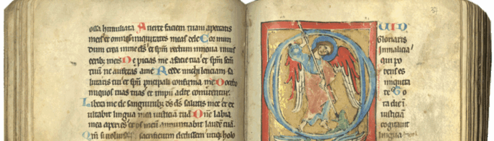


